Antarctic Land Surface Temperature (part 5)
In this article I take a look at GHCN-M land surface temperature records for Antarctic bases and unearth evidence of BADWARM (Base Development Warming)
In part 4 of this series we took a look at data collection at Orcadas base, this offering the longest running land surface temperature series for Antarctica. Although nice and shiny and supportive of the alarmist narrative, we discovered a few hidden secrets and came to the conclusion that data collection at Orcadas since 2005 is rather poor in comparison to that undertaken 1903 – 2004, being loaded with observation bias owing to equipment failure during the coldest months of the year. We also noted zero warming from 1904 – 1980, after which there is a sudden notable trend estimated at +2.19°C per century (p=0.02). Questions were raised about base development affecting measurement (urban heat island effect) among other things, as well as accuracy of measurement itself in such extreme conditions.
Measurement of land surface temperature down at the coldest spot on Earth is obviously fraught with difficulties, but these are glossed over if the alarmist narrative is supported. Back in part 3 I revealed a table of warming trends for 13 peninsula bases obtained using GHCN-D daily data massaged a little to give more robust estimates of the annual mean. As a result we observed warming trends at 4 of the 13 bases, a cooling trend at 1 base and nothing much happening either way at the remaining 8 bases. I asked why this should be so given their proximity.
Perfectly Peninsula
Today I’m going to do the same again but using GHCN-M monthly data to see what story this tells. Like most people I expect to get 12 months to my year and so I excluded all base records whose annual mean wasn’t derived from 12 monthly measurements. This sounds swanky but we must realise that we have no idea whether each monthly measurement is based on just one day or all days within that month – such is the nature of the beast!
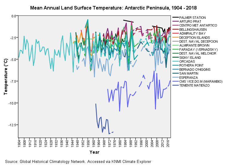
The good news about the monthly series is that it extends the data range back for some stations, Orcadas being the champion with records kicking off in April 1903. The other bit of good news is that the monthly series includes older bases that are either no longer in operation or bases that, for some obscure reason, don’t contribute to the GHCN-D dataset. A good net to cast, as it were. And so to the colourful casting of that net for 18 peninsula bases:
The first utterance that passed my lips was, “what on Earth was going on at Teniente Matienzo back in the late ‘60s?” A good question for which I have no answer. Back then it was a permanent base so they should have recorded summer as well as winter temperatures. The rather cryptic CMS VICE.DO.M is also a cool running base, this being the monthly record generated by Marambio base. Other than that it is spaghetti as usual.
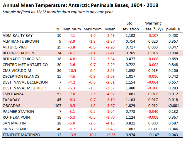
Once again I have resorted to the linear regression spanner to sort the spaghetti and the results are presented in the table below:
Aside from maxima, minima, mean and standard deviation of mean we’ve got the regression coefficients labelled as ‘Warming Rate (°C/y)’ along with the probability value associated with this. Taking 95% confidence as my yardstick I’ve coloured statistically significant warming trends in pink and cooling trends in powder blue.
We observe warming trends at 4 of the 18 bases, a cooling trend at 1 base and nothing much happening either way at the remaning 13 bases. If we consider the 4 warming bases alone we find a similar range of warming rates from 0.012°C per year to 0.017°C per year. These also happen to be the biggest bases, with Faraday now being known as Vernadsky base. Given that 14 out of 18 bases fail to report a warming trend or yield a cooling trend I’m going to assume the four hot potatoes are estimates of the urban heat island effect, though we might prefer to call this base development warming (BADWARM).
Cracking Coastal
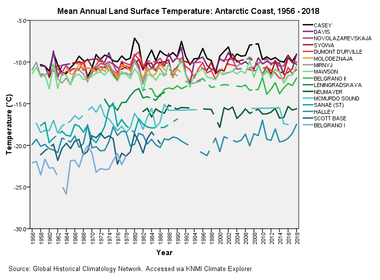
So what about coastal bases away from the peninsula? Well, I’ve got 16 of those and so I guess I better get the crayons out again. Try this:
Again we observe groupings of cooler and warmer bases, so the lesson we need to learn here is that each base seems to have its own climate. This no doubt will be due to location-specific prevailing wind exposure, hours of sunshine, oceanic current and all that jazz but I wouldn’t be at all surprised to learn that base design and use comes with its own impact. Lumping Antarctic data into one big heterogeneous temperature record is asking for trouble!
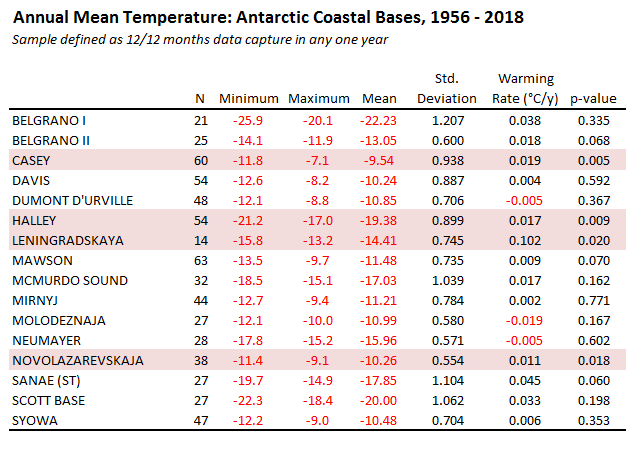
Here’s that handy table again:
This time we have 4 out of 16 bases showing a statistically significant warming trend of between 0.011°C per year to 0.102°C per year. Now that is quite a range, with Leninsgradskaya steaming along at a warming rate that is nearly ten times that of Novolazarevskaja. Flippin’ ‘eck! There’s no way this can represent genuine climate change and so we realise just how much base development, use and construction is affecting land surface temperature measurements.
It is worth pondering on the fact that 12 out of 16 bases fail to exhibit a warming trend, and I suspect this is really what is going on climate-wise. What we have, then, is a similar situation to the peninsula with a few hot bases showing warming with the majority not.
Incredible Inland
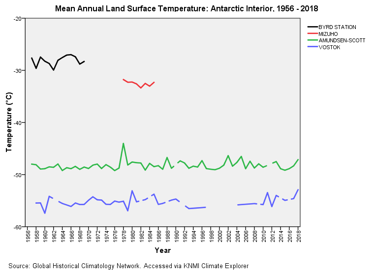
I’ve had to lump inland (20 – 200km), interior (200 – 1000km) and deep interior (>1000km) bases together, there only being four such bases in total within the monthly database. Here’s the spaghetti:
A bit bonkers, I admit, putting all these on one graph but I wanted to see just how cold it can get once you start marching inland. Viewed in a compressed manner like this it is hard to determine warming or cooling trends using eyeballs but this does serve to show us that things are not changing that much over time.
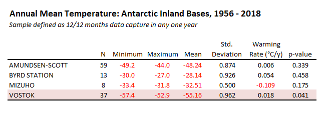
Here’s the handy table…
Well how about that? We’ve got a base that is warming at a rate of knots despite this being 1,213km from the nearest coast. How is this physically possible? Well, I’ve a bit of inside knowledge on this one because there’s an IT maintenance dude I’ve come across and it transpires some of these remote bases are choc-a-block full of tasty electronics gear whose heat output is massive. Such gear needs a power supply, which means serious-sized generators, which means local heat islands within which sits the temperature probe.
According to this contractor the American military at Amundsen-Scott have been doing some very strange things with a vast sensor array buried deep in the ice for quite a while now. This is connected to a serious amount of equipment such that air conditioning is needed to keep the server rooms cool. The guy stood out on the ice feeling the warmth coming from windows that had been opened to help cool the room. This may explain why the base has been running 10° hotter than Vostok. The purpose of the array is to record the tiny flashes of blue-white light that can occur when neutrinos pass through a large ice mass. What we have, then, is a gigantic real-time neutrino detector that computes multiple trajectories with precision.
The nature and use of these jam-packed buildings by the military is classified information but we may guess they’re not using them to check the colour of snow. If you do spot a strangely warming inland base I recommend you check out military presence before pressing the climate alarm button!
Kettle On!


NOTE: I have updated this article since publication this morning after correcting three base locations that were incorrectly marked as inland.
I see a lot of these NASA visualisations being tagged on LinkedIn these days. I know you’ve got a huge todo list, but would be interested in your views if you get chance to look at it. This one’s on CO2 levels but they also do ones on sea temperature.
https://svs.gsfc.nasa.gov/5110