The Temperature Of The UK Over The Last 100 Years (part 5)
A butcher's at daily maxima and minima over the last 100 years. Are things getting worse, and what does ‘worse’ mean?
Right then, it’s 7:40am and I’ve cleared away the rotting apples, gathered the decent ones and put the recycling bins out moments before the truck hauls into our sleepy close. I’ve a hot lemon tea to my right that is smacking my taste buds good and proper and I’ve a spreadsheet template open ready to crunch tmin (mean daily minimum temperature) for the 34 stations in my sample, data for which may be obtained here.
The tmin normals are relatively easy to calculate and I recommend subscribers go right back to this newsletter, this newsletter, this newsletter, and this newsletter to better understand what temperature anomalies mean, how they get calculated, how to correctly interpret them, and why I’m using the 1991-2020 climatological normal for my sample of stations and not the current WMO 1961-1990 normal.
Tmin & Sharks
Just in case folk are confused as to what tmin actually means, here’s the definition provided by the Met Office:
I’ll flesh this out by saying the lowest daily temperature recorded at each station is averaged over each month to provide the mean daily minimum temperature for that month. This makes for a robust estimate of how cold it generally gets at each station because the impact of outliers is averaged out. An outlier might represent an exceptionally cold spell but it might also represent issues with Stevenson screen siting and maintenance as well as probe calibration.
Here’s a good example of the weather Station at Ross-On-Wye getting off to a dodgy start back in 1930:
Point 78 is an outlier if ever I saw one! The reason for this is that, although Ross-On-Wye got going in 1930, it only recorded temperature data during December of that year, which makes for an exceptionally wacko anomaly and a fine candidate for exclusion.
With just 34 stations in my sample I can patiently pick over each and every single data point to ensure they pass muster, but if I sat on several thousand stations like NOAA, NASA, Berkeley, Hadley Centre/CRU et al then the best I could do is rely on automated quality control procedures to iron out the nonsense. The trouble is, there’s no way of telling whether these are doing a fine job unless somebody sits down and undertakes regular and extensive audits, which is both expensive and time-consuming. Trusting big data and relying on AI is like trusting a shark not to attack whilst you enjoy a splash around. Been there, done that, got the scars.
Re-heated Spaghetti Bolognese
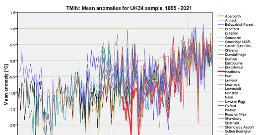
Here’s one of those extremely colourful spaghetti Bolognese plots revealing the tmin anomaly series for all 34 stations in one go:
Those strange little horizontal sticks like bent coat hanger wire are a feature of the graphing module that alerts folk to periods of missing data records. Heathrow - the champion of alarmists - is once again rendered in thick red, and I recommend you read all about donkey tails in this newsletter if you think this is depicting an exceptionally cold Heathrow over the period 1953-1961. It’s not; it’s depicting an averagely cold Heathrow that warmed quicker than all other locations: such are the joys of deciphering anomalies!
Worthy of note are the exceptionally cold years, the last corker being 2010. Yes indeed, we can suffer extreme cold snaps on a warming planet just like we can suffer record-breaking heatwaves on a cooling planet. The big question here is whether the warming of the minimum temperature record that we observe in this slide is down to climate change proper or unfortunate siting and/or maintenance of the Stevenson screens. How many of these stations are truly rural, as opposed to instrumentation sitting at the end of runways or within sprawling urban developments? I shall be attempting to answer this in a mini-study of the urban heat island effect (UHIE) that I have got planned.
The Wobbly Minimum
Our eyeballs will have noticed cycles of warmer-cooler-warmer-cooler within our plate of spaghetti, so let’s render this mass of lines down into a clear broth of annualised mean anomalies for tmin:
That’s better! We now see the undulating pattern of warm-cold snaking through the decades. In terms of minimum temperatures it got warmer during the war years before deciding to cool down through the ‘60s and ‘70s. The question is whether the current trend of warming of the minimum will continue unabated as alarmists claim1 or whether we are witnessing another cycle of something... er... cyclical.
At this point I shall tug on my beard whilst I do something horrendous; I am going to ignore the cycles and stick a straight line through all of those data points using linear regression. When I do I arrive at a point estimate for the warming rate of 0.008°C per year (p<0.001), which equates to 0.8°C per century.
In part 4 I offered an estimate of 0.7°C per century for the mean daily maximum (tmax) and hoped that tmin would make most of the going to get to the 1.5°C per century offered by the IPCC. So what’s going on? Why are estimates of warming derived from real and actual weather stations across the UK (34 of them to be precise) about half that offered by the IPCC? To answer this we better take a closer look at how IPCC derive their figures.
First Pick Your Cherries
Let’s start with a screenshot of the juicy bit within the executive summary of Special Report 15, this being the report that governments world-wide use more than any other to clobber human rights and pave the way for net zero and trashed economies:
The first thing we must note is use of bad language. The phrase ‘high confidence’ has got nothing to do with the statistical term and everything to do with policy suits playing word games. Neither does the term ‘likely’ mean anything, it being another way of expressing the opinion of those with vested interests in pushing for net zero.
The bold statement of ‘Human-induced warming’ comes across as a statement of fact whereas it is merely a statement of conjecture. To arrive at estimates of human-induced warming for SR15 climate scientists ran their Earth systems models (computer simulations) under CMIP5 (now CMIP6), this being an internationally agreed framework and datasets. Whilst these simulations enshrine many known laws of physics they also enshrine many theories of how we think the global climate works. This is necessarily incomplete and constantly under revision. Neither are all real world climate features and complexities accounted for otherwise the simulations would become unwieldy and unstable. Bits are chopped out, stuff gets simplified and guesses are plugged in. Then there’s the known knowns, known unknowns and all that wacko jazz. Then there’s the mathematical concept of chaotic dynamics which informs us that we cannot predict future states of nonlinear systems with any degree of certainty. In sum, we looking at a very elaborate lump of coding that skates on very thin ice, which is why some serious scientists dismiss the simulations as “toys”. The phrase ‘Human-induced warming according to our latest guessing game’ would be far more accurate!
The second thing we must note is the reference period for the pre-industrial era, this being 1850-1900. Those who stayed awake during geography lessons will recall something we call ‘The Little Ice Age’, which lasted from 1650-1850 or thereabouts (we can’t all agree). Thus we find the IPCC reference period conveniently catching the tail end of a spell of exceptionally cold weather. Climate scientists are always keen to mention that the Little Ice Age was merely regional. That’s fine because the region in question (North Atlantic) affected all of the long series observatories that gave rise to those early temperature records. Neither did the period end abruptly at 1850. If you read the wording in Wiki very carefully you’ll note that the last period of cooling began in 1850. The IPCC have therefore used the kitchen fridge as their reference period.
Experienced hacks will ask how many land-based weather stations were recording temperature back in 1850-1900. The answer is not as many as you’d think. A quick run through NOAA’s Global Historical Climatology Network Daily database (GHCNd) reveals the following:
Thus, we see that back in 1850 there were only 8 stations on the face of the Earth that were recording temperatures for at least 50 years - and kitchen fridge ones at that! Come 1900 that figure had leapt to 2,081 stations holding 50-year records and 1,179 stations with 100-year records. Here’s where those 2,081 stations were located:
That’s right they were virtually all in North America, with a reasonable showing in Europe and a smattering across the East coast of Australia.
So how about sea surface temperature records over the period 1850-1900? Apart from a very thin scattering of buoys we have to rely on ship-based measurements, and I’ll let Professor Jones of CRU/UEA say it in his own words:
They had to make stuff up ‘coz data doesn’t exist! If that screenshot comes as a surprise I suggest you Google climategate and make up your own mind. There’s nothing wrong with making data up (we call it estimation), providing you come clean about what has been done. The trouble is the IPCC are not coming clean.
In part 6 I’ll continue by looking at how we can carefully select time periods to maximise the warming rate for both tmin and tmax and with a bit of of luck I’ll be able to replicate the IPCC estimate of 1.5°C per century. Until then…
Kettle On!
Professional, political, corporate or amateur - I don’t tend to distinguish between folk these days.
So if the ipcc use warming from 1900 and you draw a linear regression line from that point, ignoring the earlier part of your data, you get a lovely round ~1.5degrees yeah?
Talking with Bill Johnson of Bomwatch.com.au he has traced several ship voyages in the 1800s where sea temps were taken every hour.. up the NSW QLD coast..
He found similar temps to today and very similar relationships with latitude.. has a paper ready to publish but it’s been challenged..
one paper I read showed rises in temps for coastal station but not inland eg Dubbo has similarly hot temperatures in the 30-40s to recent temps.. of 2000s Australia has three wide spreads drought decades the Federation 1901 to 06, WW2 droughts 36 to 46 and the millennial 2000 to 2010 droughts that have a large influence on temps..they often use 1950 to 80 as our reference a cool wet period..
There is much made of the Great Barrier Reefs plight of coral bleaching but virtually nothing said about the reef of Western Australia? Nor the plethora of happy coral in the tropics..
It is fairly obvious that if temps warmed the reefs would simply grow further south and coral from the tropics would migrate further south too..
Latest data shows the reef is in the best condition for many years..