
Mean Means (part 2)
Reaching for our inner climatological geek

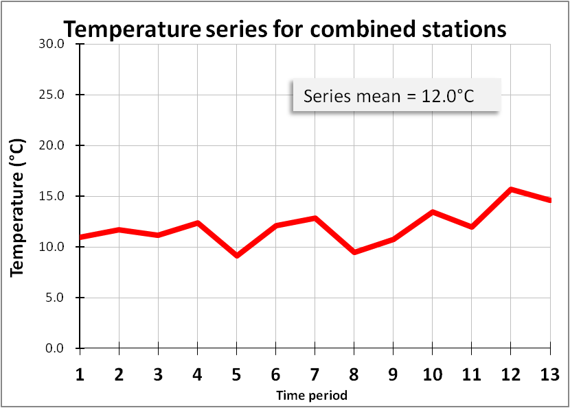
In part 1 of this series we were left looking at the following chart that gave the impression of ‘global’ warming despite 3 of our 6 fictional weather stations showing clear signs of cooling:
But I am not finished with this data just yet. The next step is to convert it from a temperature series to a temperature anomaly series because that’s what the public are fed.
Anomalies Ahoy!
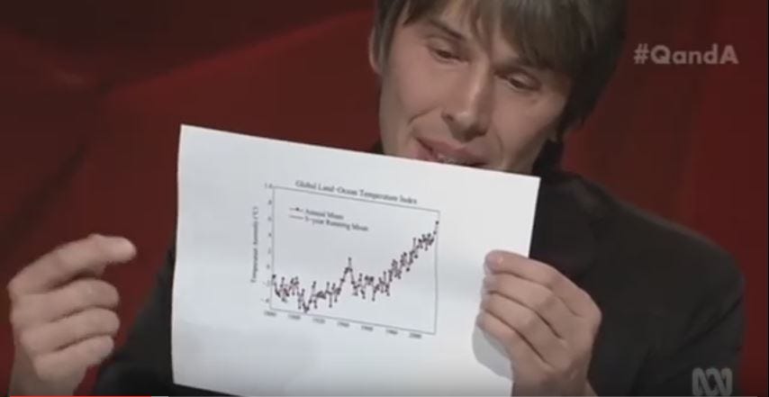
Here’s Professor Brian Cox again holding up a piece of paper on TV upon which somebody has plotted a temperature anomaly series for him. If I am not mistaken this is the HADCRUT global anomaly series that you can obtain here - I shall be coming back to this in a future newsletter.
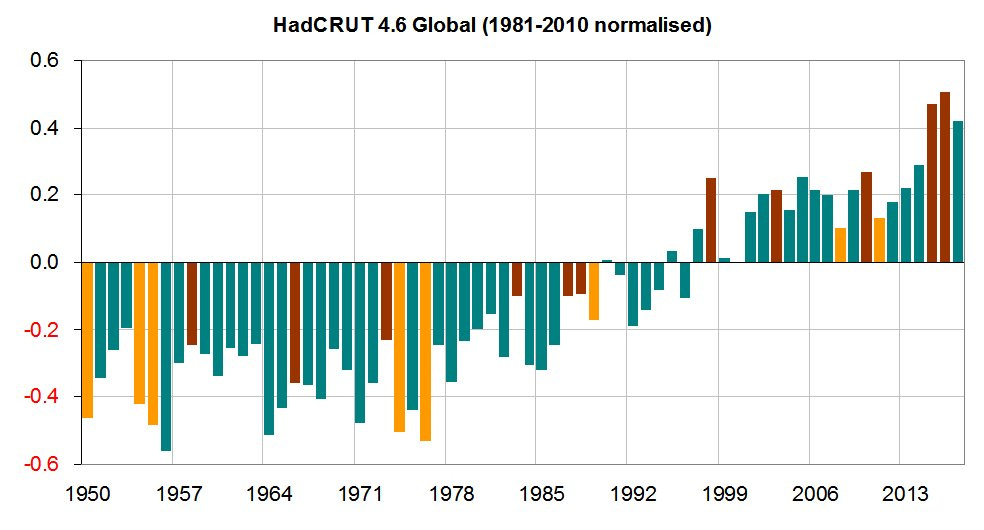
The BBC are also very good at publishing temperature anomalies without telling viewers what they are looking at. Here’s my reconstruction of a chart they presented back in November 2017 (I cannot now find the source URL - dangnabbit!):
These look very scary because they give the impression of runaway global warming in recent decades for which the culprit must be mankind. What I’m going to do now is convert my data into one of these scary series in four simple steps:
Step #1 - define your climatological normal
All anomaly series are derived using a climatological normal as a baseline reference. In the case of Professor Cox’s series this was this was the 30-year period 1961-1990. In the case of the former BBC slide (whose source I cannot now annoyingly find) this was the period 1981-2010 (does what it says on the tin). In the case of my fictional data series I shall define it as time period 7.
Step #2 - subtract things
In the case of Professor Cox’s/BBC series the median temperature for the periods 1961-1990 and 1981-2010 would have been calculated respectively and these baseline values would have been subtracted from observed values.
A little twist worth mentioning here is that ‘observed’ doesn’t mean observed in the sense of looking at a real thermometer since ‘observations’ for the HADCRUT gridded dataset product arises from “ensembles of 100 dataset realisations”. I shall explain what this means in a future newsletter but for now we can pretty much wrap it up in a nutshell using the phrase ‘modelled data’.
Since my climatological normal is only one time period then we shall simply subtract the temperature observed for time period 7 from the data series.
Step #3 - plot stuff as dramatically as possible
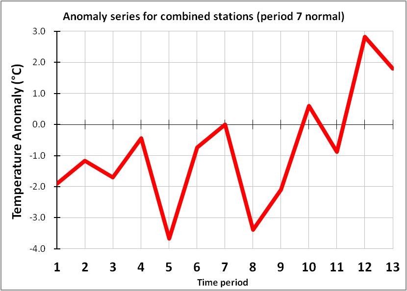
Compare this slide with my very first slide: you are looking at exactly the same data! I can now scare people into believing the apocalypse is a heartbeat away. Acting rationally, with reasoned debate and plenty of old-fashioned thinking is the last thing scared people will do.
Step #4 - fiddle with the base period
Note that my fictional anomaly series hits a value close to +3.0°C in the chart above with the climatological normal set to time period 7. If a value of +3.0°C above ‘normal’ isn’t scary enough we can always adjust the base period. Here is what happens when we set my climatological normal to time period 5:
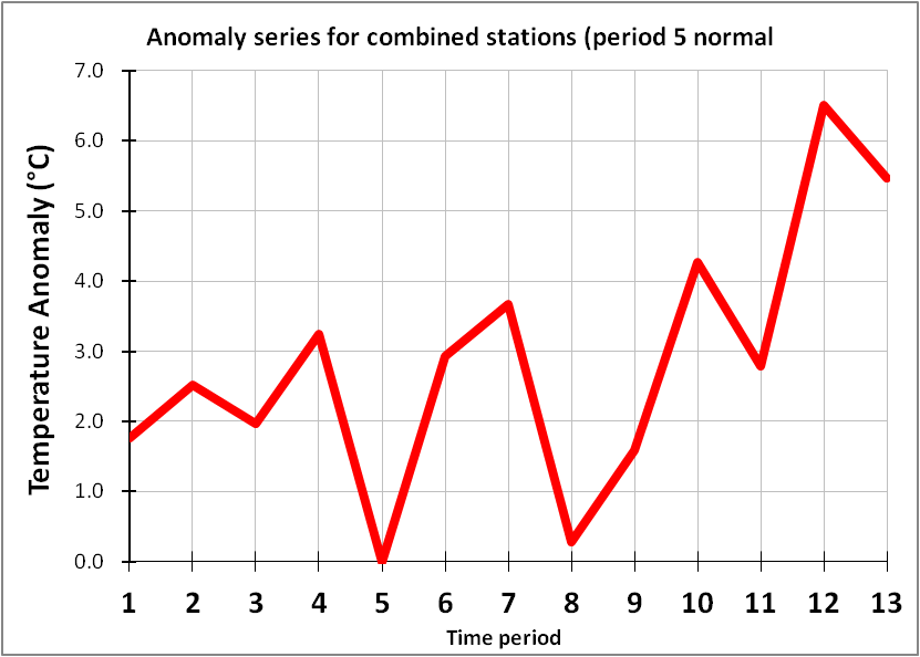
We can now go around scaring the total and utter sh*t out of people by claiming we nearly hit +7.0°C above ‘normal’ back in period 12, so if folk don’t immediately comply with the many draconian policies we’ve got lined up we’re going to put them in jail. An emotional public that is stricken with fear will not only suck this message up (it validates their position) but they’ll do the locking away for you. They won’t bother to look out of the window or consider what is happening in the real world, as opposed to the modelled world. Job done with a mouse click.
Time For Breakfast
Before we get the kettle on and the grill hot, here’s what that old BBC chart looks like when we convert the 1981-2010 anomaly series back to median annual global temperatures and have the y-axis start from zero degrees:
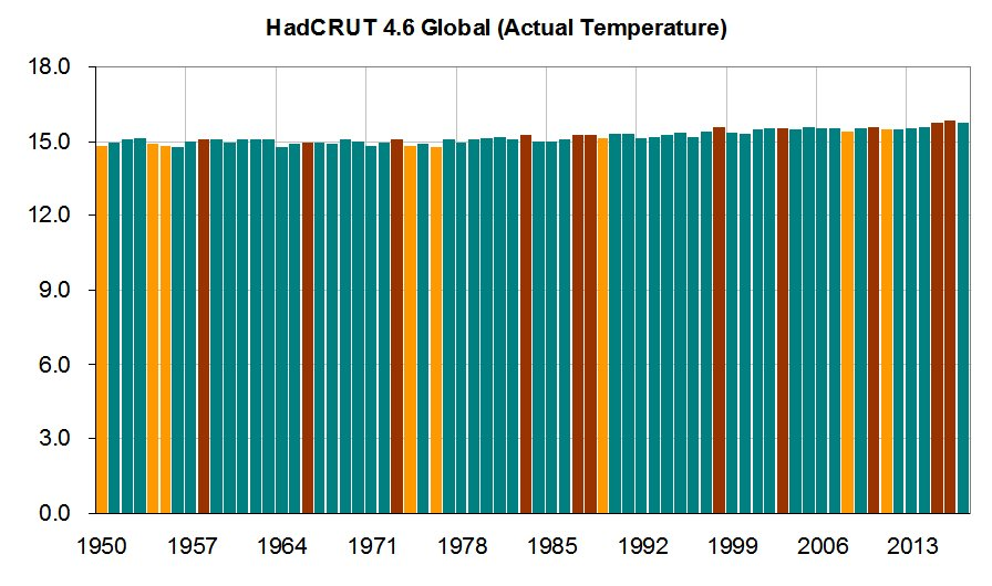
You are not going to scare anybody with a graphic this feeble!
I have yet to come across a member of the public who understands the difference between a temperature series and a temperature anomaly series, so we are in for a rough ride unless we can reduce their level of fear and boost their level of basic understanding. The ironic thing is most people distrust their government, yet at the same time they’ll swallow government-funded science and listen to their hand-picked experts.
In future newsletters I’ll be taking subscribers through the HADCRUT5, CRUTEM5 and HADSST4 anomaly series and doing interesting things like comparing them to observed (i.e. not modelled) data and revealing a few tricks of the modelling trade that help experts make things look hotter than they really are. Until then this looks like a good report to read because it all starts with a thermometer.
Kettle On!
John, often you can get the source of an image as follows:
--- click at the right end of the Chrome address bar to bring up Google Lens tool
--- click the tool then drag over the image
Instances of the image will appear on right
The BBC graph's source is: https://www.bbc.com/news/science-environment-41859288
You had me at "with reasoned debate and plenty of old-fashioned thinking". Liking it so far, and - as you see - subscribed.
I would just comment that the final graph here could (and should, really) be in Kelvin, the proper measure for a globe in space. This would make your point even better (and be the appropriate measure or "metric" as people seem to say nowadays).