
Singin’ In The Rain (part 1)
Storms also make us wet, so I decided to take a look at how wet the UK has gotten these past few decades…

Following on from Not Gone With The Wind part 1 and part 2 is this little tray-bake dedicated to what Britain does best… rain!
I’ve decided to keep the same sample grid:
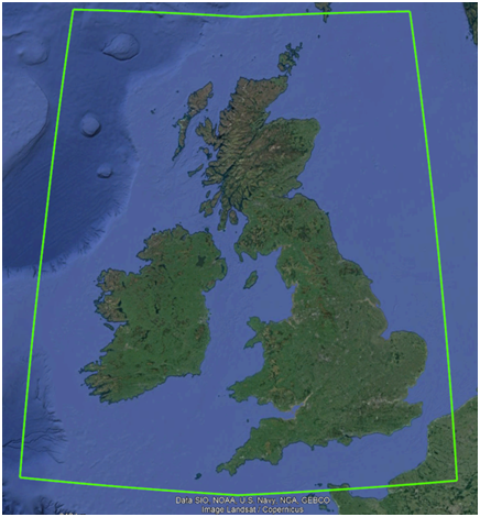
But this time I’ve flipped from ICOADS to NOAA’s Global Historical Climatology Network Daily Database (GHCNd) and that big green box will ensure I’m looking at all land based weather stations across the UK and Ireland. To ensure we are looking at the biggest and best stations I decided to limit the Climate Explorer query to those stations with at least 60 years worth of data records, there being 71 of these including three stations in Northern France but what the heck! C’est la vie!
As regards precipitation I opted for mean daily rainfall owing my distrust in data quality, with stations popping in and out of existence with the passage of time. Total rainfall would be wonderful, as would maximum daily rainfall but these require precision and reliable bucket wangling from all stations all of the time. I think not!
If anybody is brave enough to try this query for themselves they’ll end up facing a screen looking a lot like this:
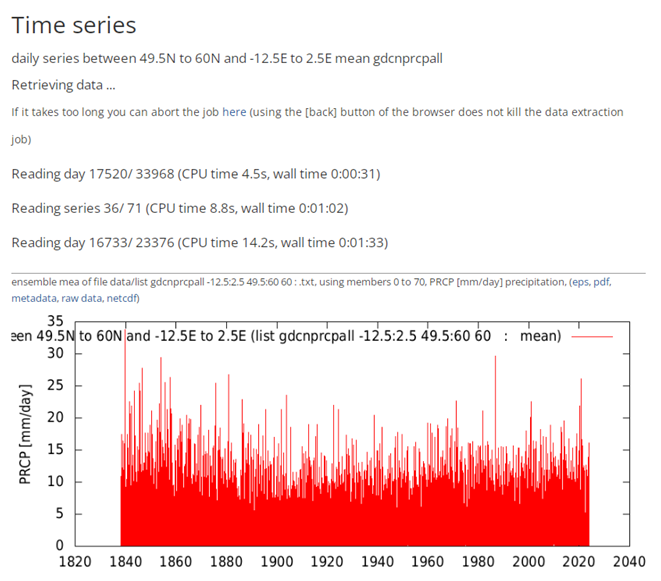
Up at the top you’ll see the boundary definition for that green box in terms of latitude and longitude, and somewhere in the mudge of text on the chart you’ll see that 60 for the 60-year record filter. The chart itself already tells us what we want to know and that is rainfall has been variable, with no obvious sign of increase.
The very brave can scroll down through the explorer output to a blue box right at the bottom where you can create a lower resolution time series. If I choose annual (Jan-Dec) then hit the make new time series button I end up with a screen like this…
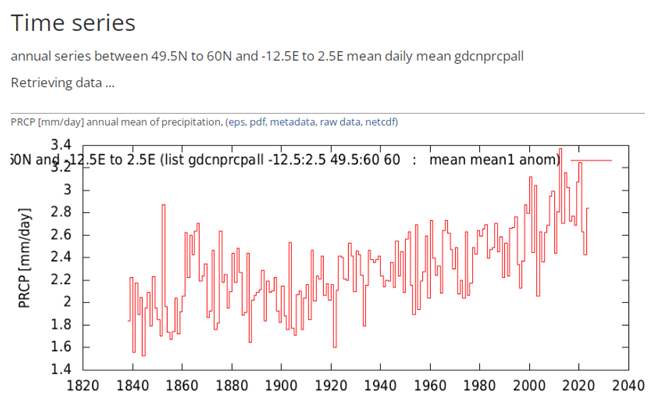
How about that for a magical transformation? It would seem we couldn’t see the annual wood for the daily trees. It’s now pretty darn obvious that mean rainfall has been on the increase since 1900 or thereabouts, which is rather intriguing, for whatever is driving the wetter weather kicked-off well before the next door neighbours purchased their second SUV and before China went coal-crazy.
NOTE: If anybody would like to throw KNMI’s Climate Explorer about to get these charts and more for themselves then please do drop a comment below. If there is sufficient interest and I can find sufficient time I’ll cobble together a mini tutorial.
What I’m going to do now is stuff this raw data into my stats package and see what else can be wrung out.
Blasted Bias!
It’s a simple matter to right click on the raw data hyperlink in these charts within Climate Explorer and opt for Save link as… to obtain a DAT file suitable for export in Excel. When I do this I always take a squizz at the bottom-most chart within Explorer that gives me an indication of missing data. Here’s a screenshot of this for our sample:
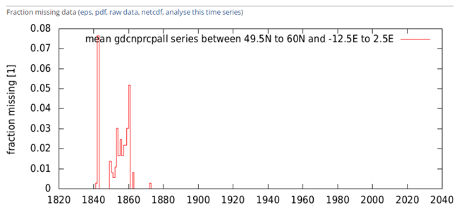
This tells me that we’ve got truly excellent data capture back to 1900 but pushing the period back to 1850 is asking for trouble unless we’re happy with a 95% capture rate or thereabouts. So far so good.
Now safely in Excel I can see we’ve got mean rainfall data from 1 January 1838 right through to 6 December 2023, which is smashing, cracking and fab! Although we’ve got a nice big bunch of means these have been derived from a shifting station sample. For example, the station at Galway in Ireland provided data from 1861 right through to 2002. If Galway was peculiarly wet then this would introduce bias into the sample such that the mean for 2003 – 2023 would be pulled down, making recent years look drier.
More common is the bias introduced by stations starting life around WWII. For example, Valentia observatory in Ireland only started collecting data in 1941, with Waterford kicking-off in the same year, and Ballyshannon coming online in 1945. These are all rather wet places and thus are going to inflate the means derived for recent years. This alone could be responsible for generating that upward annual trend. Tricky innit? In part 2 of this series I’m going to attempt to stabilise the station sample so we may obtain a more accurate long-term trend. For the time being I am going to plough on regardless!
Squeezing Some Stats
If nobody minds I’d like to plough straight into scatterplots of mean daily rainfall and the standard deviation of mean daily rainfall for the period 1900 – 2023 when squeezed into annual-sized averaging pots. If the term standard deviation glazes eyeballs think of this as simply as measure of the daily variation in rainfall over the year instead of the daily amount:
What does this all mean?
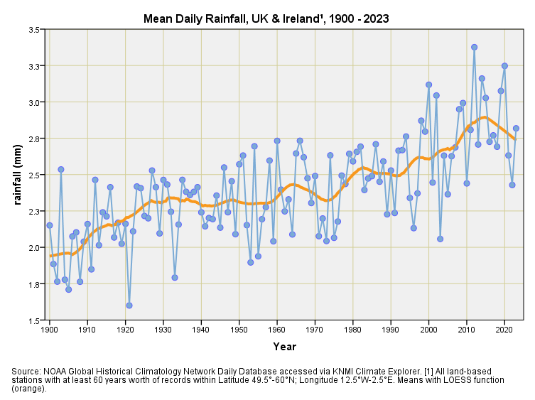
Let us start with the top slide of daily rainfall that has been averaged over each year. We can see that the series is climbing just like in that earlier screenshot. It’s a steady climb too, starting from 1900 if not before. This means that whatever is driving the UK to become wetter got going well before atmospheric carbon dioxide and global warming became a thing, and even before the ‘70s ice age scare became a thing! I doubt that the Met Office and expertistas with juicy grants will tell you this, but you can see it for yourself as plain as plain cake.
We can doubly tell it has been a steady climb because of what that wiggly orange snake has been doing, this being one of those locally estimated scatterplot smoothing functions (LOESS). That there orange curve is pretty much marking a linear growth trend estimated at +0.64mm daily rainfall per century (p<0.001). Don’t wait up. However, there is a decided kink in the tail, with a modest recent downturn. We might need a smaller bucket in future.
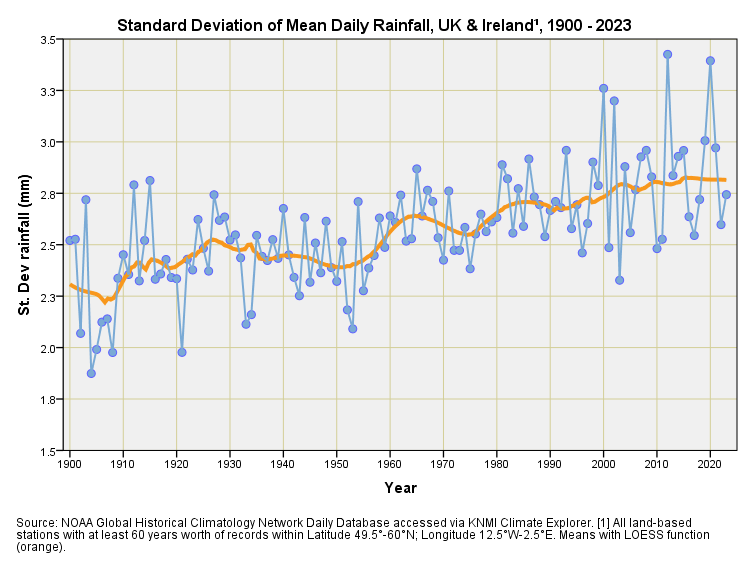
And now for the bottom slide. This is the standard deviation of daily rainfall when lumped over a year and is a measure of how variable daily rainfall has been. Without thinking too hard about things we’d expect the variability to be pretty random over time, with all the variation being encased within the space of a year (less variable in summer and more variable in winter). We’ll come to seasonal variation later but for now I want us to focus on that steady upward… rainfall is becoming more variable, folks. But don’t wait up!
Again we see a steady linear trend from 1900 onwards and my guess is that whatever is driving additional rainfall is also driving additional variability, though these changes are slight. Enhanced variability means more droughts and more deluges, and it would be nice for an atmospheric scientist to explain what they think is causing this.
Seasonal Stuff
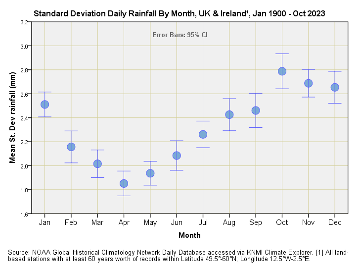
To finish we’ll take a look at the seasonal stuff in terms of mean daily rainfall and standard deviation of daily rainfall by month for the period Jan 1900 – Oct 2023:
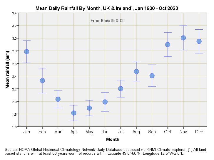
So what’s all this about April showers, Mr Jolson and Mr Disney? I think not! April is the UK’s driest month when it comes to mean daily rainfall and I can report that Mrs Dee is flabbergasted like wot I am. November we can vouch for as the wet of wets month; a good tip here is to book your late UK holiday in September.
Now how about that mirroring of this pattern by the standard deviation of mean daily rainfall? This is what we may call a groovy kind of love, and we have discovered that the wettest months are also the months that come parcelled with the most daily variability. I am sure this tells us something important about the dynamics of rainfall but I shall need to cogitate on the matter.
The key message here is that high variability with high mean rainfall is going to lead to peculiarly dry winter months as well as deluges, which is what has just happened across the UK with storm Henk. Henk is thus a child of its time, and this whole process was set in motion whilst atmospheric CO2 was sitting down at pre-industrial levels of 280ppm that is not that far from plant starvation at 150ppm – 200ppm leading to widescale disease and death. You may have guessed I am not a fan of carbon capture since I view this as a form of global suicide.
Kettle On!
Now for a spot of tin rattling…
Being self-employed these days means the time I can dedicate to data preparation, analysis and article writing is directly proportional to the income I derive from subscriptions. My substack channel has to pay its way, and remains viable only if there are sufficient subscribers. My grateful thanks to those who have supported this project thus far.
"Anglesey man has measured the rainfall every day since 1948 - BBC News" https://www.bbc.co.uk/news/uk-wales-68005382?at_link_origin=BBC_Wales_News&at_bbc_team=editorial&at_medium=social&at_campaign=Social_Flow&at_ptr_name=facebook_page&at_link_id=A1 This just popped up. Bet he's got some reasonably good data. I've often wished I'd collected some over the years, never knew it was going to become so weaponised.
Of course the Met office disagrees with you
“So there is some truth to the weather lore that April showers bring May flowers, as April does tend to be a showery month, and the warmth of May soon follows bringing the familiar colours of the UK spring.”
https://www.metoffice.gov.uk/weather/learn-about/weather/types-of-weather/rain/april-showers
I think it derives from a popular song from our grandparents time, made popular by Al Jolson.
https://en.wikipedia.org/wiki/April_Showers_(song)
I prefer the parody version “When April showers, she never closes the curtain..”