
NSSTC v6.0 Temperature Anomaly Update (part 6)
Satellites have the potential to offer the most accurate surface temperature data. In this series I analyse the latest data records from NSSTC/UAH (Lower Troposphere) for the period Dec 1978-Feb 2024.

In part 5 of this series I was led astray by the Science Editor of The Guardian and ended-up looking at the land surface temperature of Vostok Station down in Antarctica. What surprised me was just how variable the temperature can be down there, and so it is no wonder that records are broken now and then; this is just the way things are in the coldest place on Earth.
I finished the article by promising to get back on track with the NSSTC satellite data and it seemed a logical next step to see how this sophisticated data fares against data gathered in a more conventional manner using an actual thermometer. Thus, today I’m going to pull down fresh data for two state-of-the-art conventional datasets, these being the CRUTEM5 land surface temperature (LST) anomaly and the HadSST4 sea surface temperature (SST) anomaly for each hemisphere separately, and then I’m going to compare these four time series with the four equivalent hemispheric time series for freshly-picked NSSTC v6.0 lower troposphere land and ocean anomalies. The handy thing about satellite data is that it offers much greater coverage of our planet’s surface and isn’t wobbled by localised factors such as corrugated iron and concrete: we want to chase man-made warming and not man-made warming!
Get that kettle on for we’re going to contemplate some colourful slides of monthly data that exhibit the same y-axis scaling to permit direct comparison across all series, and then we’re going to contemplate a few summary statistics. I suggest we start by buttering some toasted tea cakes in readiness…
Northern Hemisphere
Land Surface Temperature
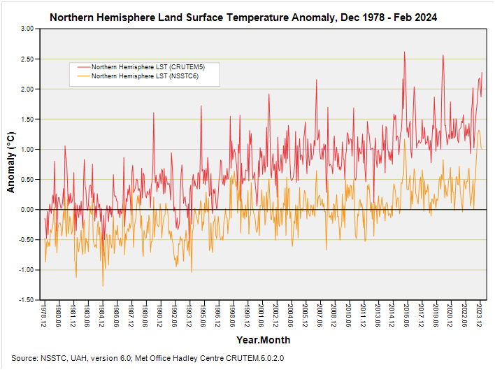
Readers are going to notice two things straight away. First, they’re going to note that the NSSTC lower troposphere northern hemisphere (NH) land surface anomalies are running cooler than their CRUTEM5 counterparts. Secondly, they’re going to note that the NSSTC lower troposphere NH land surface anomalies exhibit less warming over this period than their CRUTEM5 counterparts: so let’s put some numbers to this.
In terms of data series grand means the CRUTEM5 dataset yields a mean anomaly of 0.732°C for this period, whereas the NSSTC6 dataset yields a mean anomaly of -0.064°C, so we’ve an offset of 0.796°C to begin with that has likely arisen from differing calibration methodologies. We can fix this by re-calibrating both series to a common 1980 – 2009 climate normal period if we so desired but this is unnecessary if what we’re really interested in is the warming trend.
In this regard one of those common-or-garden linear regressions that makes me wince1 yielded a warming rate of 3.44°C per century (p<0.001) for the CRUTEM5 series and a warming rate of 2.11°C per century (p<0.001) for the NSSTC6 series. It is tempting to put the difference down to the urban heat island effect but the situation will be more complex than this.
There are some spikes in the CRUTEM5 dataset that don’t appear in the NSSTC6 dataset and I’m guessing this is down to the mass averaging aspect of the latter, with a greater proportion of the land surface covered through using satellites. In assessing datasets like CRUTEM5 we must never forget that the lion’s share of land surface weather stations are found in the United States, so these traditional data series can never be truly representative of the global situation despite a great deal of hole-filling, fudging, homogenisation and modelling to make it look that way.
Variance of the two series is about the same according my eyeballs, which is most pleasing, and both series exhibit a sudden kick upward for 2023 onward. I’m pretty sure El Niño has something to say about this! We can examine the relationship between the two series a little further by throwing them into a scatterplot:
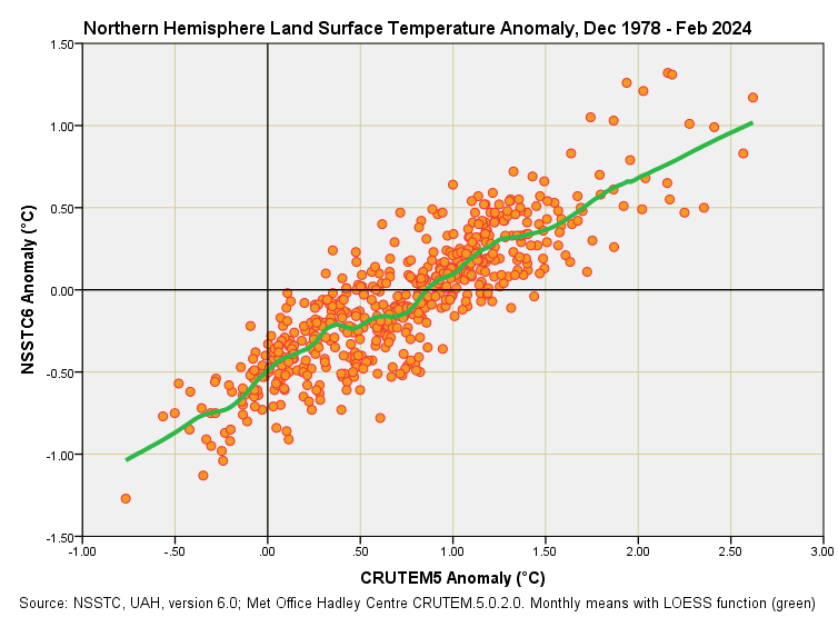
There they both are, and what a fine strudel they make! I’ve thrown down some locally estimated scatterplot smoothing (LOESS) rather than a bog standard trendline in order that we may judge whether the relationship between the two is linear or not. My eyeballs are telling me we’re looking at a linear relationship (more or less) and this is a good thing because it means both teams have gone about systematically observing the same real world phenomenon but using different techniques.
There’s no wonky stuff here that points to non-linear bias that would need to be carefully explained, and which would be terribly awkward for everyone. When we do throw a bog standard linear regression down we arrive at this simple equation for converting between NSSTC6 and CRUTEM5 values (with a bit of error thrown in, of course):
In plain English this means if take 62% of the value of the traditional CRUTEM5 anomaly, then shave half a degree off this we’ll end with a value similar to that measured using satellite techniques. In case geek-nerds are about I’ll mention that the inverse relationship is this:

Though thrown in the pot for a bit of fun these equations reveal that land surface measurements taken from ill-placed and poorly maintained Stevenson screens around the world are running hotter than the troposphere directly above them dictates. Anthropogenic Global Warming (AGW) must come from above and not below if we are pointing the finger at atmospheric CO2… unless we’re happy to measure what tarmac is doing on a sunny day and call it AGW.
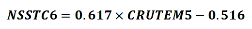
Sea Surface Temperature
And now to consider the sea surface temperature (SST) across the northern hemisphere, this being thankfully devoid of tarmac…
Not as flamboyant is it? There’s that general offset again with the mean of the NSSTC6 series fetching-up at -0.055°C compared to 0.436°C for HadSST4, but this time it’s hard to tell if the warming rates are any different using eyeballs alone. I shall thus reveal the estimates to be +2.00°C per century for HadSST4 (p<0.001) and +1.52°C per century for NSSTC6 (p<0.001). A formal test of significance revealed these slope estimates to be significantly different (p<0.001). This is most curious for it means the bucket and buoy data brigade is running hotter than the satellite sweep series and so we have to consider the possibility of a marine heat island effect arising from biased observations. Tricky, innit?
Eye, eye! Wots All This, Then?
Before we move on to the scatterplot I want to point to something rather curious that catches my eye. Take a look at the roughness of the HadSST4 time series from 1978 – 2004; now compare this with the smooth but humpy-bumpy pattern from 2005 onward. They don’t look like the same data series! We don’t see this Jekyll and Hyde nature with the NSSTC6 data, so what gives? What is the Hadley Centre crew doing differently from 2005 onward?
And now for the scatterplot:
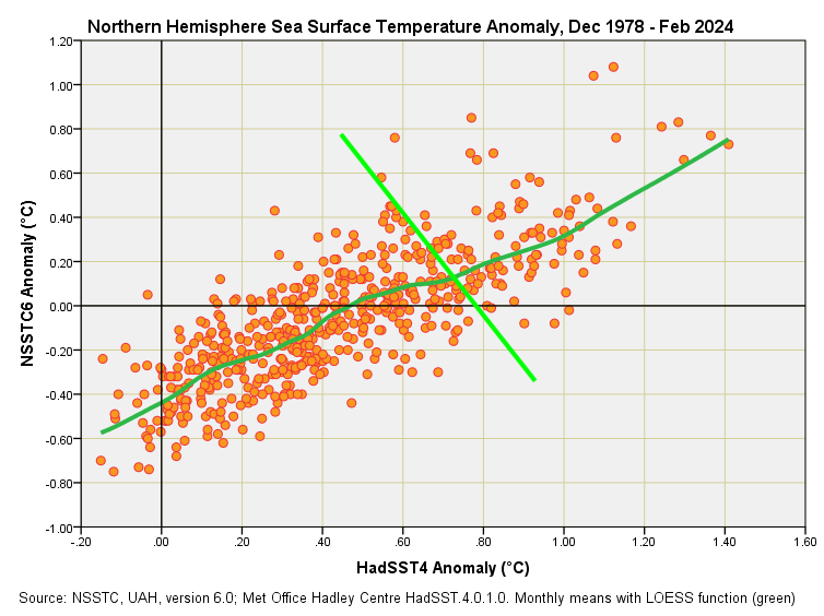
Kinky! Things start off well and proper but then there’s a kink in the scatter at around +0.5°C that shovels the HadSST4 data into a higher anomaly bracket compared to NSSTC6. This sort of kink is what we’d expect if somebody has been fiddling with things. Imagine Maradona’s hand of God descending on this slide and grabbing hold of all the high value points and shoving them back over to the left a bit along the vivid green shear line that I’ve marked out – would this slide now make more sense?
Yes it would.
It’s as though a decision has been made by the Hadley crew to ‘adjust’ the sea surface temperature data from a certain point in time, and we only get to notice this with reference to the NSSTC6 satellite data, and with reference to the variance inherent in the monthly series. H’mmm…
I don’t know about you but this unexpected wrinkle has gone and whetted my appetite so I am going to stop here for a slice of cake, a cuppa, and a think…
Kettle On!
Owing to serial correlation, my dear Watson!
The HadSST4 data from 2004 on has a sinusoidal wave on top of the trend. If annual variation why not up to 2004 or in the NSSTC6 data. Looking forward to your ruminations. Regarding the last scatterplot from about 0.8 degC (HadSST4) the LOESS line seems by eyeball not to be a good fit to the data (running low). My eyes or LOESS issue?
The Argo system of sea temperature measuring bouys cam into effect from 2005. THe Argo system should be very accurate and have good spatial distribution. Pre 2005, SST were primarily buckets and intakes measurements from ships. So maybe the data pre and post 2005 look different because they actually are?