Cloudy Intervals With A Chance Of UHIE
A little treat for paid-up subscribers in which I crunch mean and maximum daily temperature for all GHCNd stations with records stretching back >120 years
Back in the day the feature film first reel ran out, some crazy adverts played on the screen informing us of treats available in the foyer (including dancing hotdogs) and a smart lady walked down to the front with a little tray of sugary goodies strapped to her neck. I always went for a Kia-Ora, which I sucked on noisily (mostly on purpose) and sometimes got treated to a lolly with bits stuck to the surface.
Today I am going to treat those who have taken out a paid subscription by doing something terrifically tasty. I am going to run a KNMI query on the entire GHCNd dataset and ask for daily mean temperatures for every station on the face of the globe with records stretching back 123 years or more. The query will then crunch the overall annual mean from this matrix for those years with 95% data capture or better, converting everything into standard WMO anomalies.
This is what we may call ‘the big picture’, and rightly so for it should tell us what has actually been going on across the globe (well, the Northern Hemisphere mainly ‘coz that’s where the vast majority of weather stations are located) as opposed to what experts and the media tell us what has been going on, and as opposed to what gridded products from NOAA, NASA, Berkeley, CRU, Hadley Centre etc etc claim has been going on. They say raw honey is good for you, and this applies to raw temperature data!
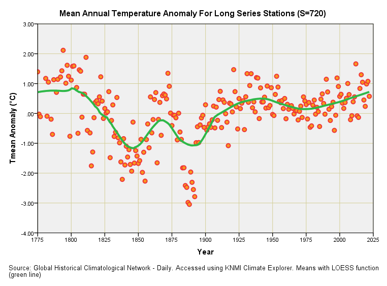
Some 720 GHCNd stations were identified with daily mean temperature records stretching for 123 years or more and this is what their combined mean annual anomaly series looks like:
Isn’t that fascinating? I’ve taken the liberty of adding one of those LOESS functions (green line) to guide the eye in a more curvaceous manner than one of those linear regression jobbies. Prior to 1900 there won’t have been many stations collecting temperature data, and those that were will have been situated in prestigious and rather leafy collegiate cities like Oxford, Milan and Zürich that are now wilting under urbanisation (a.k.a. The Urban Heat Island Effect or UHIE). I shall come on to the station head count in a minute to provide some context but for now we may as well bask in the shade of climate realism.
The Little Ice Age shows its teeth just prior to 1850 and then again just prior to 1900 with dips in the ‘pseudo global’ mean temperature. In this respect we may note that the IPCC and other expertistas are fond of using 1850 as the start point for analyses. Starting at the tail end of a cool period to make a point about modern warming, eh? Talk about stacking the deck in your favour!
Ignore everything prior to 1900 and we appear to have some sort of cyclical behaviour imposed on a possible warming trend, though that trend will at least partly be driven by the urban heat island effect as well as several other factors we can’t really pin on fossil fuels if we are being frank and honest about matters and not displaying signs of psychotic behaviour.
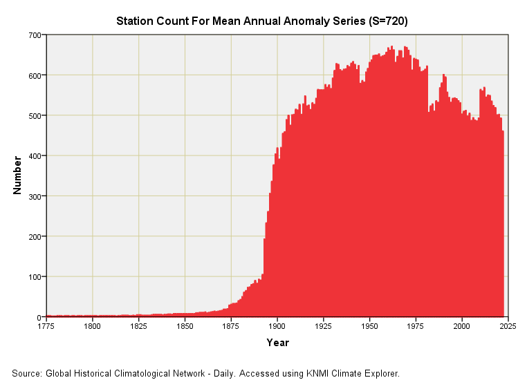
We could talk about this slide until the cows come home (whilst there are still cows to come home) but it might be best to move on to that there station count so we get a feel for reliability:
We discover that, out of that short list of 720 GHCNd stations with records stretching back 123 years and more, only six hundred-odd managed 95% data capture back in the glory days of real science. If I’m being precise about this we observe a peak in activity of 670/720 (93.1%) during the year 1962, with a waning of enthusiasm since then. There’s a flurry of fresh activity around 1988 when the IPCC got going (quelle surprise!) and another flurry around 2009. Come 2022 and we’re back to the level of observation we observed back in 1904.
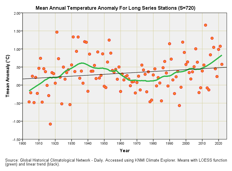
If we to do something slightly cunning and adopt the 460 active stations of 2022 as our analytical threshold then we could, in all honesty, start the stats clock ticking from 1904 when 458 stations were checking their thermometer every 95 days out of 100. If we apply a filter we get this slide:
Now that is what I call wavy, and I’m going to put my betting money on the mean anomaly falling back down over the next few decades, but not before the Western economy has been squeezed out of existence by those few elites who set the climate change charade going in the first instance in order to save the fiat petrodollar.
So what of that thin black line? Well, I can confirm that it er… confirms (by the skin of its teeth, mark) a statistically significant positive trend of +0.26°C per century (p=0.048) at the 95% level of confidence. This is not exactly filling me with alarm and I’m not about to go throw soup at a work of art. What it is going to get me doing is running the same analysis for the mean maximum daily temperature and mean minimum daily temperature.
Why so? Because a mean trending upward like this can be the result of things getting hotter during the day or things getting less cool at night (or both).
Are Things Getting Hotter During The Day?
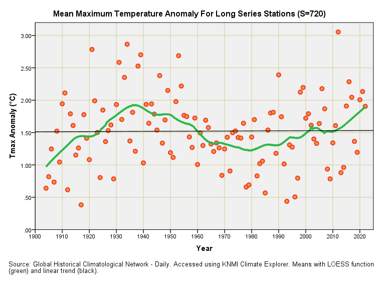
Computer says “NO!”
We observe cyclical behaviour but no overall trend upward, with linear regression indicating a statistically insignificant cooling trend of +0.02°C per century (p=0.915). According to this sample of between 458 and 670 GHCNd stations our days have not been getting hotter and hotter over time; they’ve been varying about a constant level since 1904.
Now isn’t that strange? Here we all are, bombarded with the message of man-made global warming for decades, that has evolved into the message of man-made climate change for a few years (and even climate ‘emergency’ according to some journalists), with little Greta telling us to act as if our house is on fire, and yet zero net change is what the hardcore data is telling us. If we do the science rather than follow it we find a rather fascinating warming and cooling cycle whose period looks to be about 120 years or so.
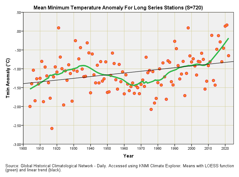
Are Things Getting Less Cool At Night?
Computer says “YES!”
We observe cyclical behaviour along with an overall trend upward, with linear regression indicating a highly statistically significant warming trend of +0.47°C per century (p<0.001). According to this sample of between 458 and 670 GHCNd stations our days have not been getting hotter and hotter over time but our nights have certainly been getting less cool.
An Explanation If You Please!
Thus, we have zero evidence of net warming during the day and decent evidence of net warming at night. What I’d like is for someone to explain to me how fossil fuel use can lead to this dichotomous situation.
I’m happy to go with concepts of thermal storage such that the radiative solar input of the day is captured by excess CO2 and/or water vapour in the atmosphere, or that it is prevented from escaping back into space by increased cloud cover arising from warming, but in doing so I’ll need to retaliate by asking why excess CO2 in the atmosphere isn’t driving warming during the day as well as at night. Does CO2 magically go into hiding during the day or something? I don’t think so!
Hence the waving of arms in the air and the playing of the ‘cloud card’ by alarmists trying to defend their cherished position. Except that clouds are proving darn tricky to understand, and a quick glance at articles on this page reveals the impact of clouds is still to be fathomed - but more on this in a future article! The cloud card also leads to a paradox in that if man-made warming produces clouds that drive a day-night differential then the cloudiest time of year surely would be the summer!
Brushing the role of clouds aside for the moment what I am inclined to think is that urban development around the Stevenson screens brings lots of extra tarmac, brick, concrete and steel year-on-year that all serve to locally store the radiant energy of the day. A fine example of this farce is provided by the Stevenson screen at Cambridge Botanical Garden, that once sat in a grassy enclosure but is now over-shadowed by the whopping great Sainsbury Laboratory and shiny new Plant Growth Facility (a big greenhouse) both of which helped create a new English record temperature of 38.7°C on 25 July 2019 (see this article for more):
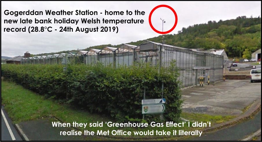
The Welsh are equally as devious as the English, and also fond of greenhouses to help nudge alarmism along:
Every evening we all get given a clue to all this as the weather person invariably ends by saying, “and of course it will feel a few degrees warmer in our cities.” That few degrees warmer arises not because the sun shines harder and hotter in our cities but because energy is stored in lots more stuff. Such is the game that is being played.
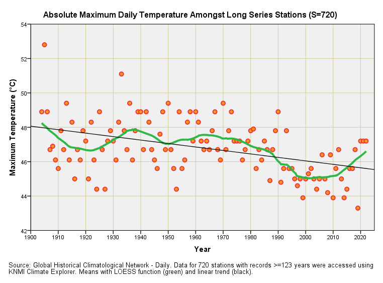
Whilst we’re on the subject of record-breaking temperatures let us crank the handle and plot out the highest daily temperatures recorded at those 720 long series stations held in NOAA’s GHCNd database:
Oh dear! This surprised me somewhat because I had put my betting money on a modest positive trend. That’s gambling for you, and I now have to explain why the hottest temperatures being recorded amongst that sample of 720 GHCNd stations have been falling over time. Not just falling, mind you, but doing so in a periodic (jiggy jiggy) manner. Linear regression indicates statistically significant cooling in the maximum daily temperature attained to the tune of -2.02°C per century (p<0.001).
The Head Thing
What folk need to get their head around is the numerical fraud that is being perpetrated by Met Offices when they say “the hottest temperature on record since records began”. Firstly, you can bet your bottom dollar that all record-breaking UK temperatures are made at airports (e.g. Heathrow) or adjacent to greenhouses (e.g. Gogerddan) or next to some recent substantial development that hasn’t been mentioned (e.g. Cambridge Botanical Garden), these being places that consistently record higher temperatures owing to the considerable urban heat island effect.
Secondly, you can bet more bottom dollars that since records began doesn’t mean when records really began way, way back in the seventeenth or eighteenth century (which is always implied) but when that station became operative, which might have been last year. For Heathrow (the UK’s all-time favourite record-breaking hot spot) that means 1948 and not 1900, and most certainly not 1659. Despite Heathrow’s string of recent records with glittering celebrity status we have no idea if the summer of 1947 was even hotter, let alone the summer of 1937. In fact, these record-breaking claims are closer to propaganda than they are to science for, as any statistically-minded bod will realise, you can continue to have temperature records broken on a cooling planet.
Thus, with our brains washed clean of brainwashing, we can view the above slide with the genuine curiosity it deserves. We may dare to conclude that the hottest absolute daytime temperatures recorded amongst 720 stations around the globe have been in steady decline. The average daily maximum temperature across the station sample, however, hasn’t budged - as indicated by the fourth slide.
It terms of the really hot stuff it’s not getting hotter, folks, and I’m pretty sure the climate bods down at the Met Office realise this (and may even confess to such in their tea break). What is happening is that it’s not getting as cool at night in those locations affected by urbanisation, and this pushes up the mean temperature. In turn that inflated mean is being used to sell alarmism. Sneaky innit?
I’ve now had the nudge from the booth upstairs so the second reel is loaded and the film ready to start…
Kettle On!



Goodness me. The trend downwards.... We may still be here in 6 yrs and a month after all
FYI I have revised this article since it was first published. There's also a new and rather crunchy slide choc full of nuts.