
Central England Temperature (part 6)
A sideways look at the longest instrumental record of temperature in the world

In part 5 of this series I continued my support of alarmism by considering three mathematical models that linked mean annual Central England temperature observations (HADCET) for the period 1659 – 2021 to values for atmospheric CO2 concentration for the northern hemisphere. We discovered that all three models (linear, nonlinear, loglinear) gave near identical results over the range of observation (275 – 420ppm CO2) but differed markedly in their predictions for future scenarios of 1,000ppm and 4,000ppm CO2. Only one model (loglinear) got close to estimating the theoretical mean temperature of -20°C for the condition of zero CO2, this model indicating substantial saturation of the greenhouse effect such that mean temperatures would not exceed 18.5°C even at atmospheric concentrations of 4,000ppm. These findings are based on actual data and thus are empirical in nature, these essentially being at odds with bizarre claims of activists and experts alike for runaway global warming. Runaway warming never happened when Earth experienced levels of 4,000ppm and beyond, and it is not going to happen in future, except in the nightmare visions of some seriously warped people.
What I need to do now is take my willow bat and play a stroke at the googly that is causality. Has mean temperature over the period 1659 – 2021 really been dependent on atmospheric CO2 concentration, or has atmospheric CO2 concentration been dependent on temperature? Or something else entirely, perhaps? We should be able to determine the truth of the matter given we have 363 annual points in our pocket, and we shall start by considering the first order difference.
First What?
The first order difference for a time series sounds fancy but it is simply babble for considering the year-on-year changes. Hence, if atmospheric CO2 was recorded at 320ppm, 324ppm, 326ppm, 323ppm over four years then the first order difference would yield values of +4ppm, +2ppm, -3ppm. If we derive differences for both mean temperature and CO2 we can them plot these out as an X-Y scatterplot, the logic being as follows:
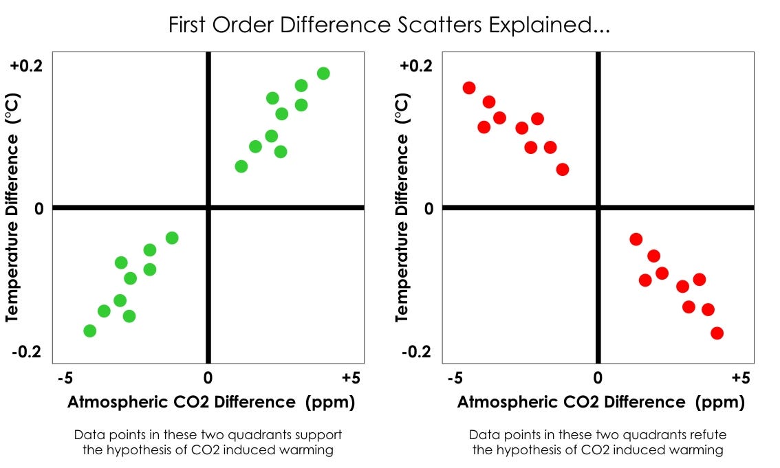
Over on the left we have two scatters that support the notion of CO2 induced warming in that the temperature difference rises when the CO2 difference rises, and the temperature difference falls when the CO2 difference falls (though causality is ambiguous).
On the right we have two scatters that refute the notion of CO2 induced warming in that the temperature difference falls when the CO2 difference rises, and the temperature difference rises when CO2 difference falls.
With that understanding of what we are about to see tucked into our belt let us now grab some real data…
The Real Thing
The real thing never quite does what you expect and here is a decent example of that…
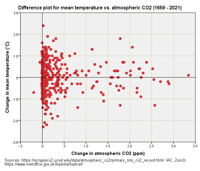
Two quadrants are squished up on the left owing to the tendency for atmospheric CO2 to increase rather than decline, though it has declined a fraction on 18 occasions. Squishing essentially leaves us with just two quadrants to consider, the top right being in favour of the CO2 induced warming hypothesis, the bottom right throwing a spanner in the works, for these are instances when atmospheric CO2 increased but temperature did not.
Super keen folk may want to count those little red blobs so I’ve taken the liberty of furnishing a summary table to avoid eye strain:
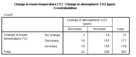
If we set aside the 21 occurrences with no change in temperature then we have a 2 x 2 table with 16 + 156 = 172 occurrences in favour of alarmism and 14 + 155 = 169 in favour of rationalism. Although the alarmists have won the headcount by a short neck they ideally need to explain away those 169 contrary observations. They may also be dismayed to learn of a Fisher Exact Test p-value of p=0.849; that is to say, the distribution of counts can easily have come about by chance.
In plain English there is nothing to see here folks, just a random jumble of points that both support and refute the notion of CO2 induced warming. If we were looking at atmospheric CO2 concentrations below 180ppm things would be different, with CO2 induced warming being clearly evident. Here’s a cracking 41 min lecture by a top bod explaining why.
So, then, a random jumble of points it shall be and if we’ve understood the lecture we’ll know the reason why we don’t see clear evidence of CO2 induced warming for concentrations up at 280ppm -410ppm.
Wot No Evidence?!
Convincing alarmists of basic physics and the value of empiricism is pointless ‘coz they’ve gone and got religion and that religion censors all opposing viewpoints and ideas. So much for the scientific method, huh?
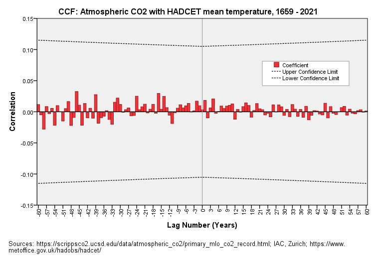
No doubt there are some folk reading this who’d be more comfortable having more than one analysis to bash alarmism with, and that includes me. I have thus fried-up a decent cross-correlation function plot, being a powerful technique we’ve met many times before:
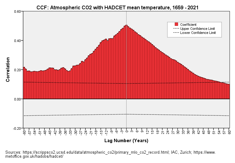
Above is a cross-correlation function plot (CCF) of atmospheric CO2 with HADCET mean annual temperature for the period 1659 – 2021. I guess most folk understand the basics of correlation whereby we take two sets of data and crunch a single number that provides an index of their similarity, this number commonly being the Pearson correlation coefficient. Cross-correlation is pretty much the same thing except we lag one series by a step in time then re-calculate the lagged correlation. Details of this powerful analytical technique can be found here but the key thing to note is that this technique permits us to determine if there are delayed effects. For example, if the land surface temperature rises a few years after atmospheric CO2 increases rather than within the same year (lag zero).
In this plot the red bars represent the correlation coefficients obtained at different lags, there being both positive and negative lag values. A positive lag correlation is one where temperature is rising after CO2 and a negative lag correlation is one where temperature is rising before CO2. Statisticians always have to be concerned about chance effects and levels of confidence, and so those dashed grey lines mark the 95% confidence boundary (p=0.05); anything sticking beyond these is not likely to be a chance effect.
If we contemplate this slide we see a red mountain whose peak is centred on lag zero. This is telling us that values for mean temperature and atmospheric CO2 correlate strongest within the same year. This is a good thing to spot because theory dictates the greenhouse gas effect (GGE) is instantaneous in its action; it’s only when you get convection within gigantic atmospheric and oceanic cells that delays in energy transfer will occur.
The second feature to spot is that palisade of positive red bars at positive lags. These indicate a rise in temperature after a rise in atmospheric CO2 and are what GGE is all about. No funny business there, just plain old global warming in accordance with the tenets of alarmist theory.
The third feature to spot is that palisade of positive red bars at negative lags. These indicate a rise in temperature before a rise in atmospheric CO2 and are thus anathema to GGE; funny business abounds! Now the darn interesting thing here is that correlations are still popping up as statistically significant at the -60 year lag mark. This is the result of positive feedback whereby a warming world produces more CO2 as a result.
Cogitate & Differentiate
If we cogitate on the matter we’ll come to the realisation that we face an almighty chicken and egg situation, with CO2 raising temperature and temperature raising CO2. That is quite a situation to have been quietly swept under the carpet!
We may ask if there is any way to resolve the koan and there is indeed a statistical spanner we can try - we can run a CCF plot on the first order difference. What this will do is yield a series of lagged correlations of year-on-year differences in measurements taken. If CO2 is driving temperature changes and it is doing so primarily on an instantaneous basis (hint: peak correlation was at lag zero) then year-on-year changes in which CO2 rises will be a period when temperature also rises. Equally, a year-on-year change in which CO2 falls will be one in which temperature falls (all things being equal), all of which takes us back to the logic of the first slide.
Without further ado I present to you a cross-correlation function plot of the first order difference for atmospheric CO2 with HADCET mean annual temperature for the period 1659 – 2021:
The first and most obvious feature to note in this slide is the total absence of any statistically significant correlation out to ±60 years.
What does this mean in plain English? Incredibly, it means that there is absolutely no empirical evidence to support the notion of CO2 induced warming.Thus, we observe that temperature is fluctuating and CO2 is fluctuating, there being no direct and obvious causal connection between them in the real world. This is why the IPCC base their highly politicised conclusions on Earth systems models that have been programmed to support the narrative.
Mother’s Memories
It is worth noting that a first order difference CCF plot will only show a cross-correlation signal if there exists a mutual ‘memory’ effect spanning two or more years. Lack of significant correlations tells us that the year-on-year changes for land surface temperature and atmospheric CO2 not only fail to correlate at lag zero (i.e. within the same period) but also that there is no lagged effect lurking beyond this. The beauty of the CCF approach is that nobody can argue, “ah, yes, but you haven’t taken account of lags.” I just did - and out to ±60 years.
What we have, then, is evidence of an energy exchange system with no obvious directional structure or causality, these two concepts being interchangeable. A bi-directional flow that achieves thermal equilibrium in a complex manner is perhaps a good way of thinking about this, and this seems to be supported by the latest findings from MIT.
It looks to me like the experts over at IPCC and beyond have hacked a rather beautiful and elaborate process by politically forcing the forcing and putting it down to unruly and sinful humans, especially the UK who thoughtlessly started the industrial revolution. At this point I suggest we break for a snack whilst our leaders push vast sums of reparation money around the globe according to their fancy and investments in order to create global slavery that is for our own good.
Kettle On!
If only our leaders were leaders and if only the media remembered what their job is but sadly they have either drunk the Kool-aid or are more motivated by profit than truth. What did Solzhenitsyn say? - 'Live not by Lies' The corporate capture of every aspect of nature continues apace and people will suffer. I wish more would wake up!
If you are minded I would love to see a detailed critique of this
https://cp.copernicus.org/articles/15/1485/2019/cp-15-1485-2019.pdf
to reconcile apparently earlier harvests and worried winemakers, with climate change skepticism.