Central England Temperature (part 1)
A sideways look at the longest instrumental record of temperature in the world
If you haven’t come across this extraordinary dataset before today you are in for a treat! Daily and monthly data records for this corker may be downloaded from here and a useful PDF providing background may be found here. The Met Office Hadley Centre provides the following handy summary:
These daily and monthly temperatures are representative of a roughly triangular area of the United Kingdom enclosed by Lancashire, London and Bristol. The monthly series, which begins in 1659, is the longest available instrumental record of temperature in the world. The daily mean-temperature series begins in 1772. Manley (1953, 1974) compiled most of the monthly series, covering 1659 to 1973. These data were updated to 1991 by Parker et al (1992), who also calculated the daily series. Both series are now kept up to date by the Climate Data Monitoring section of the Hadley Centre, Met Office. Since 1974 the data have been adjusted to allow for urban warming: currently a correction of -0.2 °C is applied to mean temperatures.
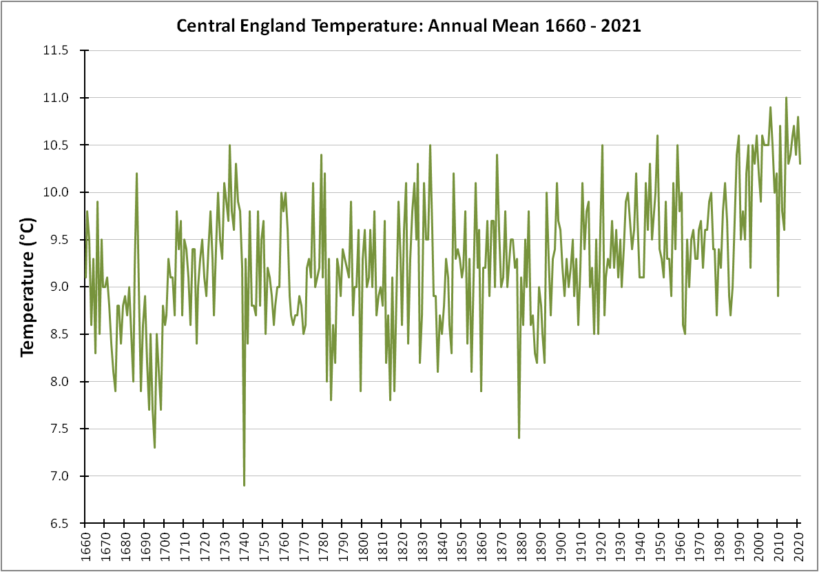
I confess to a certain thrill when analysing data records as old as 1659, being a year in which the mean temperature for January kicked the series of with a sober 3.0°C. Richard Cromwell (third son of Oliver Cromwell) was the Lord Protector for England, Scotland and Ireland back then, giving way to King Charles II a year later. Now that is what I call historic, and I’d like to start with an unadulterated green chart:
There are a few features of great interest here. There are three exceptionally cool years of 1695, 1740 and 1879, and I’d be looking at volcanic activity to explain these, though a wonky polar vortex would also suffice. In this regard we should note that scholars suggest the Little Ice Age came to an end around 1850, so that last outlier at 1879 might well be a marker for the end of that climate epoch. Bags of peas thaw if left out of the freezer so I wonder just how much natural warming has been taking place that we’re inadvertently assigning to fossil fuel use.
The warming rate from 1960 – 2015 looks impressively scary at +0.022°C per year (p<0.001; OLSR) until you realise this is pipped into second place by 1690 - 1730 at +0.037°C per year (p<0.001; OLSR). If that’s what the climate can do without an exponential rise in carbon emissions we may need to re-think the really big levers to climate, ‘coz it wasn’t CO2 back then!
The Long View
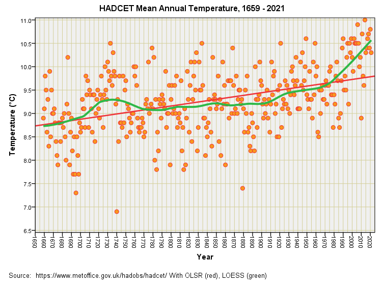
If we take the long view of 1659 – 2021 then the overall warming rate for Merrie England fetches up at +0.003°C per year (p<0.001; OLSR) or just 0.3°C per century, this being significantly less than the IPCC global estimate of +1.5°C per century.
Let’s have a look what that OLSR trend looks like and compare it to a LOESS function (a.k.a. the green snake):
It sure looks like warming took off after 1970 but why did carbon dioxide wait until then to suddenly perform its planet warming magic? Several factors spring to mind and I shall be illustrating these as articles progress, meanwhile there’s a key comparison we need to make…
HADCET vs. CRUTEM
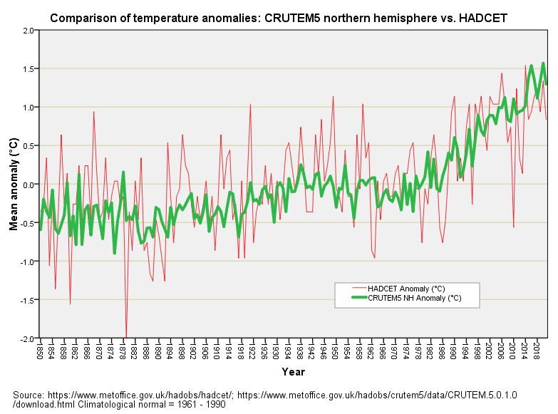
The crew at CRU produce the CRUTEM state-of-the-art land surface temperature anomaly series, copies of which may be found here. We’ve seen how the CRU crew somehow managed to cool the rather warm 1930s and 1940s in relation to a sample of 34 UK weather stations in this article, and so I thought I’d cross-check matters using the venerable Central England Temperature dataset (HADCET). To do this I converted the annual mean series into anomalies using the WMO 1961 – 1990 climatological normal. Herewith the result:
Once again we see a somewhat compressed CRUTEM5 series in relation to a decently varying series arising from actual temperature data, this compression arising from substantial data processing. And once again we see evidence of a cool-running CRUTEM over the period 1930 – 1960 or thereabouts, with hints of artificial cooling creeping in to earlier periods.
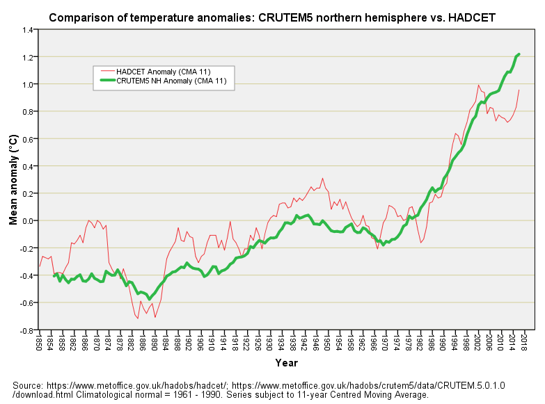
I appreciate this is hard to judge for those who haven’t spent decades eyeballing graphs so I used a econometric trick and smoothed both series using an 11-year centred moving average function. Try this for size:
Now isn’t that altogether rather interesting and terribly revealing? Not only are the crew at CRU artificially cooling the ‘30s and ‘40s, they’re cooling pretty much anything before 1960. For good measure they’ve decided to artificially warm anything post 2005. Now that is what I call cooking the books: bowled and caught in the slips by the longest available instrumental record of temperature in the world, no less!
Climategate
You will find that the climategate affair is played down by Wiki, debunked by fact checkers and pretty much ignored by any author you’ll find using Google but that shouldn’t surprise anyone these days. As a one-time GOV bod in charge of survey bods I appreciate the error and estimation that always accompanies compilation of substantial datasets so we must expect the same of CRUTEM, except this doesn’t look like error; this looks like a systematic attempt to artificially cool the past.
We can check this by running a related-samples Wilcoxon signed rank test to analyse the positive and negative differences between the two series, the null hypothesis being a zero value for the median of differences. This test revealed 121 negative differences and 41 positive differences, with a p-value fetching up at an extraordinary p=0.00000000445. In betting lingo we are looking at odds of 1 in 224,719,101 against this bias happening by chance. Now that is what I call deliberate!
Did They Get Anything Right?
Yes indeed they did. If we narrow the period down to 1975 – 2005 then a related-samples Wilcoxon signed rank test yields a value of p=0.410 for 12 positive differences and 19 negative differences; that is to say, there’s no significant difference in the distribution of positive-going and negative-going differences.
The fact that the two series match reasonably well over a recent period of 31 years sufficient to pass a rigorous stats test is all the more indicative that something fishy is going on with the CRUTEM5 anomaly record prior to 1975 and after 2005.
Ironing The Sheets
Whilst we’re at it we should note the artificial warming of the period 1878 – 1894. There’s a hint of a dip in the CRUTEM record but it looks to me like they’ve excluded some rather cool data points by declaring them as outliers, dodgy or erroneous.
The thing about climate alarmists is that they don’t like inexplicable excursions of the temperature record either way since these always beg awkward questions; the infamous hockey stick graph being their best attempt so far at hiding the past (a decent re-telling of that tale may be found here). With said and done I’ll cogitate on what to fry up next. Until then…
Kettle On!


Many of us are unhappy that CET is not independently created now. Is it still the same as the Manley series or has it been "adjusted" at all?
Followed the 'hockey stick affair' link. I just don't get people. Why are they so intent on alarming everyone? I feel really sorry for the youngsters earnestly glueing themselves to things :(