Arctic Sea Ice (part 5)
A bracing analysis of the poster child of globalist alarmism: what you always wanted to know about Arctic sea ice but were afraid to ask
In part 4 of this series I promised to grab some Arctic land surface and sea surface temperature data and have a look see. I would have typed ‘have a look sea’ but considered that too groanworthy given my delicate head after a night of boozing and scoffing more dark chocolate than is good for me.
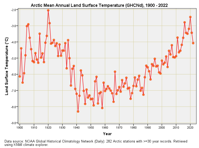
So… land surface temperature. Well, that’s an easy task for the magnificent KNMI climate explorer, for all I had to do was dial in some coordinates and ask for all GHCNd stations with at least 30 years worth of contiguous data records for mean land surface temperature. Some 282 Arctic stations were retrieved and their combined annual mean time series looks like this:
How about that for a banana?
It would appear the Arctic landmasses have been getting warmer since 1940, in keeping with the very best alarmism, but what about that thumping hump of hotness back before WWII?
And how come the Arctic landmass cooled between 1920 and 1940 at a time when industry was revving up the fossil-fuel motor?
Once again the word is WERGH! We may propose that this big banana might be something to do with sample bias, for although KNMI climate explorer found 282 Arctic stations to crunch, I am going to bet good money most were not operative back before WWII.
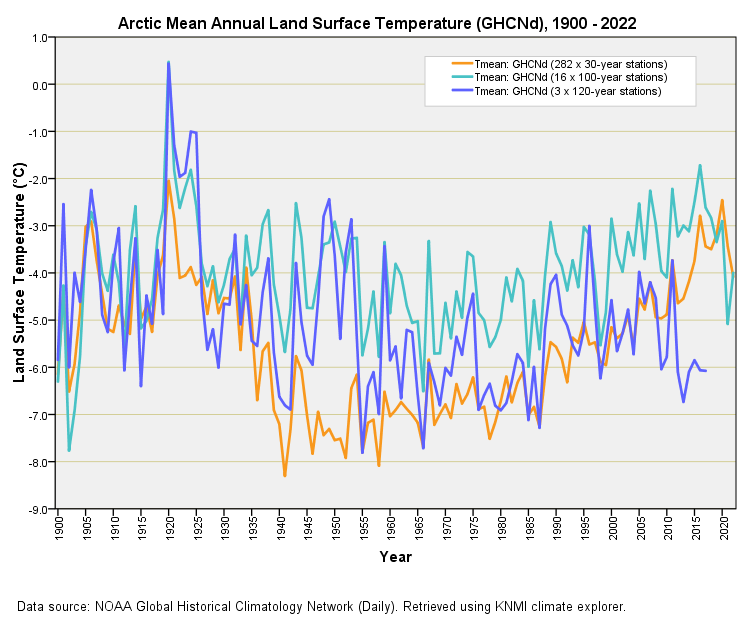
Thus, with a fresh pot of tea on the go, I ran the KNMI database query again using 100 years as my contiguous data filter to ensure we were looking at proper-job long series Arctic stations rather than some hotch-potch of itty-bitty modern things. It turns out there aren’t many venerable Arctic weather stations; just 16 to be precise. If I push the boat out and go for 120 years worth of contiguous data collection then my sample drops to a trifling three Arctic stations (Jokkmokk and Karesuando in Sweden; Верхоянск in Russia). And boy, does this make a difference. Have a look for yourself:
In the orange corner we have my original sample of 282 stations with at least 30 years’ worth of contiguous temperature data. In a serene sea green we have the sample of 16 stations with at least 100 years’ worth of contiguous temperature data, and in a royal blue we have that sample of 3 stations with at least 120 years’ worth of contiguous temperature data.
Thus, we observe that the only stations that were active throughout this period (that curiously closed in 2017) show a slight cooling of the Arctic from 1920 to 1960, with only a hint of warming thereafter. The 16 long series stations show a clearer warming trend from 1960 onward, but we must note that warm hump centred on 1945 that came and went – could this be an artefact of WWII activities in the region, with weather stations concomitant with military bases, townships and airfields?
It is curious that the sample of 282 stations with 30 years’ worth of contiguous data doesn’t exhibit a ‘war hump’ and I presume this is because the majority became operative during the cold war years (these also being cold years)
Three samples, three stories.
I can choose a sample to support alarmism and I can choose a sample to smack alarmism on the bottom. I’m hoping that this serves as an example as to how seeming bone fide climate data can be constructed to support any hypothesis we want.
Wot No Reference?
What we need to remember is that no meteorological organisation ever set out to measure climate change back when a general interest in weather was born. They set out to measure local and regional weather largely for commercial and military reasons, with public service thrown in for good measure. Despite the impressive label ‘Global Historical Climatology Network’ there is no global network of true reference stations constructed to exacting specifications with the express aim of conducting long term measurement. All we have are national meteorological organisations paying lip service to the urban heat island effect/instrumentation changes and passing their product off as quality data, which then gets lumped into a database.
So, which of these samples am I going to use to represent Arctic land surface temperature? Likely none of them. I’m going to have to study the mean annual temperature record at each and every station in order to arrive at a hand-picked sample that appears to represent stable data collection for an extended period for as many stations as possible. Welcome to the field of settled science.
Musical Stations
Well then, I went back to KNMI climate explorer to pull down all GHCNd Arctic stations with 90 years’ worth of contiguous data to give me a reasonable sample of 24 long series stations. Daily records for each station were crunched into annual means, with years rejected if the the annual sample total didn’t hit a 300 day cut-off. This was done to minimise bias from part year operation. Some keen folk will ask why not a 365-day cut-off and the answer is that you’ll end up with no stations!
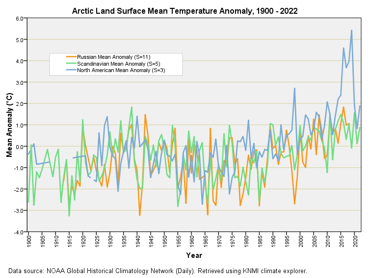
With near-complete data records crunched I then selected the 14 years when all 24 stations were in simultaneous operation, this giving me a reference period on which to base climate normals. With temperature anomalies derived I then eyeballed each plot and discarded any series that looked weird, this leaving me with a sample of 19 non-wacko Arctic stations of which 11 were Russian, 5 were Scandinavian and 3 were North American.
It seemed eminently sensible to derive overall regional means and I’m glad I did so, for something was found buzzing in the ointment. Take a look at this:
What the heck was going on at those three North American Arctic stations over the period 2014 – 2020? Did somebody let off a tactical nuke? I’m hoping that sober folk are realising just what a game of musical stations is being played by the big players and their experts, who will claim all manner ‘coz the ‘data’ says so. This is worthy of a collective harrumph!
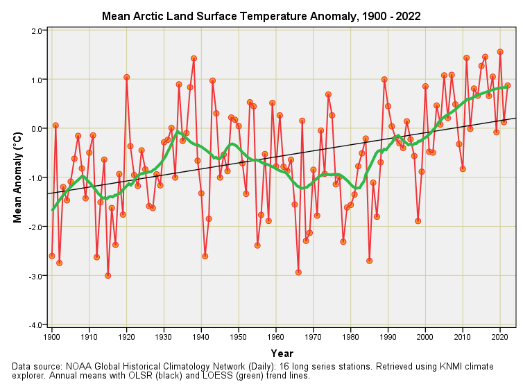
Harrumph I say again, and NOAA can stick its North American Arctic data up its own igloo, for I am going to average the Russian and Scandinavian series to give me a somewhat sensible, super sizzling, sixteen station sample. Here it is, then, Dee’s best take on the bake for the Arctic:
So yes, there’s warming up in the Arctic and simple linear regression (black line) indicates a warming rate of 0.12°C per decade (p<0.001; OLSR). But it’s not as simple as more CO2 = more warming for the locally estimated scatterplot smoothing (LOESS) function (green line) wiggles about revealing initial warming 1900 – 1935, followed by cooling 1935 – 1980, followed by warming 1980 – 2022. How is it possible to witness 45 years of Arctic cooling during the most intense period of industrialisation?
It should be obvious that atmospheric CO2 cannot be the primary driver, but I shall come back to this in a future article when we shall look at the relationship between CO2 concentration and the Arctic climate. One step at a time as they say!
Kettle On!


Excellent work - to answer your question as to how it is possible to witness cooling in the most intense period of industrialisation the alarmist types seem to have invented the term 'global weirding' to explain why cooling is part of warming. Just as Orwell predicted 'War is peace. Freedom is slavery. Ignorance is strength'
"What the heck was going on at those three North American Arctic stations?"
JD. I wonder if the time series data from the Global Monitoring Laboratory 1973 to present will unearth a worm? I plotted data using their graph tool 2010-2020 . Eyeball says no spike?
https://gml.noaa.gov/dv/iadv/graph.php?code=BRW&program=met&type=temp
Nice picture of the Barrow station, Alaska on their first page:
https://www.gml.noaa.gov/