Antarctic Sea Ice Index (part 1)
A trip down under: a quick look at Antarctic sea ice using NOAA’s National Snow & Ice Data Center (NSIDC) Sea Ice Index (SII)
The National Snow and Ice Data Center offers some pretty tasty to the public through their online portal, which may be found here. Up to now I’ve been baking sea ice extent data for the volatile Arctic and so it makes sense to dip down below and have a look at what has been going on in the really big freezer.
If you manage to successfully negotiate NSIDC’s FTP server you’ll end up with a CSV file for Antarctic sea ice extent dating back to 26 October 1978, that contains 14,573 ‘daily’ records to 26 March 2023. The first thing we must note is that daily records were reliably kept from 1988 onward, with zero missing data after this point. Up to this watershed moment in NSIDC history missing records ran to as many as 29 per month, with an average of 15.0 missing records per month. That’s quite a lot of missing data and so the first kitchen chore of the morning was to replace missing values using a rather handy linear interpolation function within my stats package. This is not as dodgy as it sounds for a quick squizz at the data capture pattern reveals they were measuring ice extent every other day between October 1978 and December 1987, so we’re talking minimal fudge filling. Whilst I was at it I whipped out ARIMA time series analysis to estimate the first 25 missing values from 1 October 1978 to 25 October 1978 just to make things neat, tidy and nicely monthy catchy wormold.
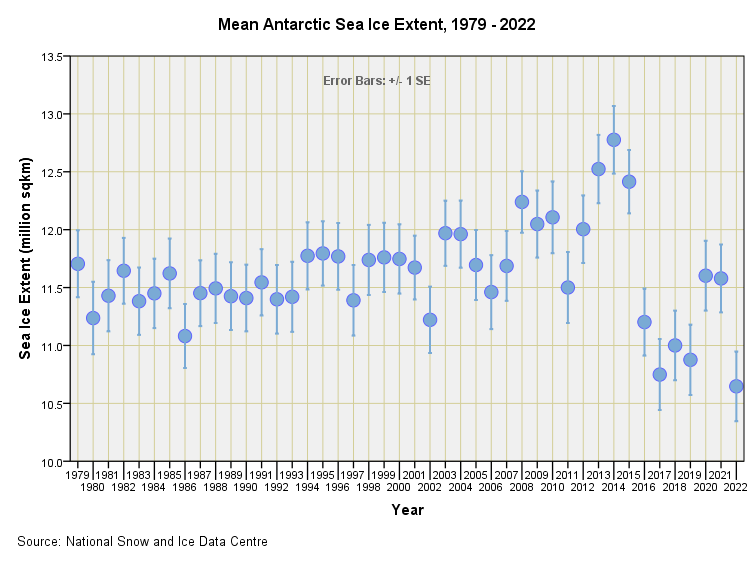
The final file fetched-up at 16,246 daily measures from 1 October 1978 to 26 March 2023 that I boiled down onto 534 monthly means and standard deviations, along with 44 whole year aggregates of the same. With all that done I guess we better take at look at the 44-year series:
This is totally fascinating! We observe very little change right up to 2002 when growth accelerated to a maximum held during 2014, after which there is one hell of a dramatic decline! A sudden decline as startling as this might be genuine in that real ice melted away but it could also arise from a change in definition or measurement technique, so I’ll try a dig into this a little more. One issue that I’m aware of from digging around back in 2017 is that ice shelves and sea ice proper tend to get mixed up in the microwave mush. The devil is always in the detail. As regards stuffing a linear trend through this lot we find a non-significant positive slope of +0.003 million square kilometres per year (p=0.544), which is flatter than I can cut bread for my morning toast.
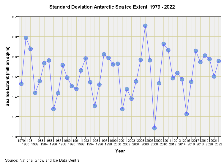
If we suspect something isn’t quite as it should be definition-wise we can consider the progression of the standard deviation of sea ice extent over time. Such a plot gives us an insight into variability of sea ice as a dynamic process over time. We might assume that if sea ice were going through a sudden onset of genuine rapid melt then this might be reflected in increased instability and thus inflated variance just beforehand. Save for 2006 and 2008 this is not what we observe:
This looks pretty much like variation around a constant to me, whose mean is a standard deviation of 5.63 million square kilometres over the period 1979 – 2022. If I run this series through a Wald Wolfowitz runs test we discover it is a random walk (p=0.446), this supporting the notion that definitions/detection methods have changed rather than underlying ice melt dynamics.
Monthly Variation
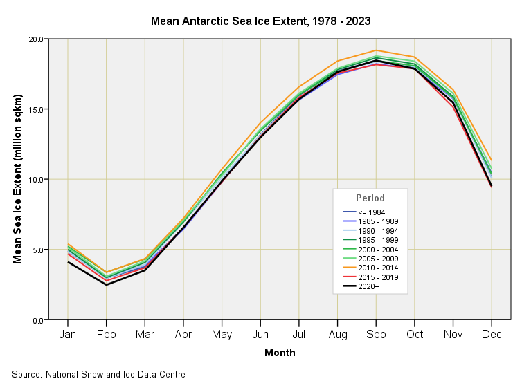
If we plot out mean monthly sea ice extent by quinquennial period we get this colourful slide:
There isn’t a great deal of difference between periods apart from that generated by what could well be a change in definition, but at least we get to see the annual high is during September and annual low is during February, this being the inverse of the seasonal pattern we saw for the Arctic.
It is worth noting that an overall mean seasonal high of 18.52 million square kilometres followed by an overall mean seasonal low of 3.01 million square kilometres indicates that Antarctica loses 15.51 million square kilometres of sea ice on average each and every year, this representing an annual loss of 84%. If you do come across an alarmist in alarm mode over ice loss down under ask them if they are losing sleep over 84% seasonal sea ice loss or multi-decadal fractional loss incurred through ice shelf fracture (more on that later).
This strong seasonal pattern, following an almost perfect sine wave is going to generate some pretty strong spectral harmonics and we’ll be taking a look at these next. Until then…
Kettle On!


Interesting as always to get behind the data with you. I wish schools would go back to teaching proper knowledge rather than as Ron Desantis recently remarked 'a political ideology that puts trendy, truth-relative concepts above learning' because the average person has literally no concept of what statistics present or hide or represent and thus have no idea what is contained in climate data (or any data) nor do they have any intellectual tools to question it.
That’s 64x the area of the United Kingdom.