Antarctic Land Surface Temperature (part 1)
I take a look at land surface temperature for the Antarctic continent to find rather patchy data and a situation that is being shamelessly exploited by the alarmist press
In the last article we took a look at Antarctic sea ice extent in relation to sea surface temperature only to discover a complex picture. Between 1979 and 1993 sea ice extent waxed and waned with the seasons, with no obvious relationship to sea surface temperature. After 1993 a modest negative relationship appears between sea ice extent and SST. What we need to do now is take a look at the land surface temperature down under and see what this tells us.
I don’t trust the highly-processed gridded products produced by NOAA, Berkeley and the Hadley Centre, so I once again followed my preferred path of digging out daily temperature data from individual stations within the Global Historical Climatology Network (Daily) Database (GHCN-D) using the rather handy Climate Explorer.
A quick query yielded 56 stations within Antarctica with daily records dating from 1954 to present, with the earliest data being collected at Mawson Research Station. Here’s a snippet from Wiki to whet the whistle:
The Mawson Station, commonly called Mawson, is one of three permanent bases and research outposts in Antarctica managed by the Australian Antarctic Division (AAD). Mawson lies in Holme Bay in Mac. Robertson Land, East Antarctica in the Australian Antarctic Territory, a territory claimed by Australia. Established in 1954, Mawson is Australia's oldest Antarctic station and the oldest continuously inhabited Antarctic station south of the Antarctic Circle. It houses approximately 20 personnel over winter and up to 53 in summer.
Location, Location & Location
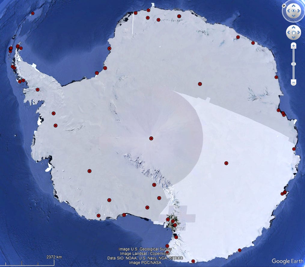
The mantra of the urban estate agent equally applies to the Antarctic, perhaps more so. Let me pull up a slice of Google and reveal where those 56 bases sit:
The first impression is that many stations are located on the coast or very near to the continental coast. A quick count reveals 39 of the 56 stations are within 20km of the coast, so the land surface temperature measured at these is going to reflect the warmer coastal climate (‘warm' is not a word I should be using for the coldest place on Earth).
Though not easily deduced from this screenshot a good many bases sit on the Antarctic peninsula (the sticky-out bit top left). Another quick count reveals 16 of the 56 bases are located along this long bit of land rather than on the mass of the continent proper. Right up in the top left-hand corner you’ll see a blob marking the island location of Orcadas Base , operated by Argentina. As Wiki states this is the oldest Antarctic base that is still in operation, and it first stuck a thermometer up back in 1903.
Hot Favourite
Orcadas is a favourite of the alarmist press because much warmer temperatures are recorded there, so we get treated to headlines alerting us to all manner of record temperature and ice melt that gets slapped with the label ‘Antarctica’. But here’s the thing… the base is officially an ‘Antarctic’ base according to WMO but, at 60.73°S, it’s not even sitting within the Antarctic circle, which begins at 66.57°S! This is Antarctica, Jim, but not as we know it.
In real money this base is sitting 645km North of the Antarctic circle. Doh, face palm alert! If I get Google’s ruler out we discover that it is located some 3,264km from the South Pole, yet only 3,055km from downtown Buenos Aries. This is called climate science, but I think we ought to start calling it something else.
I am hoping that readers have come to realise that all boils down to location, location and location even down in the frozen wastelands of Antarctica. In fact, especially down in the frozen wastelands of Antarctica. What I’ve done at great expense, therefore, is measure the distance of each base to the nearest coast and lumped them into four categories:
coastal (0 – 20km) – 39 bases
inland (20 – 200km) – 9 bases
interior (200 – 500km) – 5 bases
deep interior (>1000km) – 3 bases
This way I can analyse temperature data in four broad categories if so desired, which means we get to see if climate change is happening across all of Antarctica or just the warm bits next to the ocean that favour the alarmist narrative.
Your Tiny Bulb Is Frozen
Antarctica is a pretty hostile place to hang out your equipment, especially during the winter, so we shouldn’t expect it to work 24/7/365 like it does in downtown Ross-On-Wye. What is going to make matters worse is that equipment failure is going to be more likely during periods of exceptionally severe weather. This is going to introduce bucketfuls of sample bias, with temperature readings favouring warmer periods.
To avoid constant equipment failure and minimise the effort needed for maintenance (which can be a lethal business) it’s also wise to stick your thermometer on the roof of a building or somewhere in the middle of a base camp (that might be undergoing development and expansion). So yes, bizarre as it may seem, the urban heat island effect also applies to temperature measurement down at the coldest spot on Earth. We shall see examples of this, but I want to start out by giving a feel for operational span.
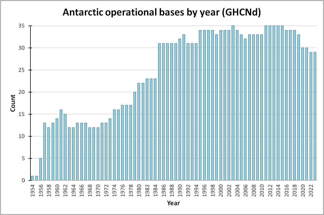
Out of a total of 56 bases offering daily data some 29 are still in operation in 2023 (51.8%), which is a good start, so let us have a look at the number of operational (in a daily sense) bases over time:
Back in the glory days of 2011 – 2015 a total of 35 bases were offering daily temperature data, with interest in running a daily series waning since then. The 1957 sudden surge is interesting, perhaps spurred on by the deepening cold war. We see another surge in 1985 and I wonder if this might have been driven by the 1973 oil crisis, or perhaps another cold war jitter (Antarctica is crawling with military). In terms of record span only 11 bases have daily records spanning 50 years or more that are still operational in 2023 but Orcadas Base, in one of the warmest spots, does offer monthly records dating back to April 1903. Splendid though this may be, Antarctica is not a place for making sweeping statements about climate change (unless you want to cherry-pick). I shall be looking at the monthly data series from Orcadas in a future article.
Please do bear in mind that just because 35 bases were delivering daily records in any one year doesn’t mean that they were collecting data 24/7/365 during that year. What we can do to get a handle on data capture is to count the number of daily records logged for each year of operation, thence to tabulate mean annual daily records in descending order. When we do this we find Wilkes Station coming out top of the decent data pile with a mean of 350.7 daily records per year for the 7 years it was open (1957 - 1963). Bottom of the pile is Fossil Bluff with a mean of 0.50 daily records per year for the 4 years it was open (2003 - 2006). This might sound like a crazy average but it boils down to just two temperature measurements in four years!
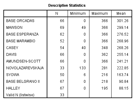
In terms of the ‘big 11’ bases with records spanning 50 years or more that are still offering daily data, here’s a tabulation revealing their data capture rate:
Top of the pile is Base Orcadas, with a 66-year year daily record span (1957 – 2022), and offering a mighty mean capture rate of 301.3 daily records per year. We may note the minimum of zero daily records for some years, so there are going to be a few holes even for the best of the best (I shall be looking at the Orcadas monthly record a little later in this series). Bases to be wary of in terms of measurement bias are going to be Halley Research Station and Base Belgrano II since they can only muster 25% daily data capture at best.
Halley’s Vomit
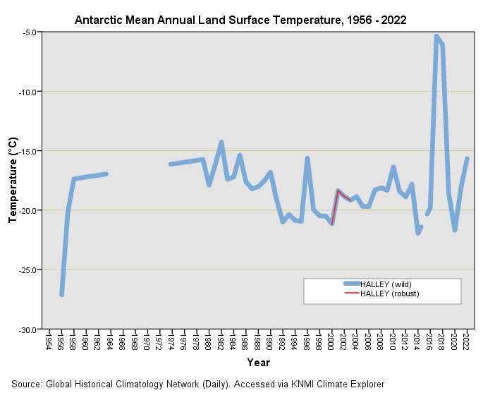
The good news is that, having access to daily records for all 56 bases, I can crunch my way through a spreadsheet to arrive at a set of reasonably robust annual mean temperatures for bases whose data collection rate surpassed 50% in any one year. I can also crunch a series of ‘wild means’ by ignoring the number of daily records gathered each year. To illustrate this, here’s a plot of wild and robust means for Halley Research Station:
The red bit is what we can reasonably trust since data capture will have exceeded 50% for these years - everything else must be viewed with suspicion. That includes the dirty great ‘heat wave’ for 2017 - 2018 and the freezing-as-hell start back in 1956. We could, at this stage, borrow a trick from the alarmist’s book of magical illusions and claim there has been clear evidence of unprecedented warming at Halley Research Station, with 2017 and 2018 yielding record temperatures 15°C above average. No doubt as journobods we’d be able to find an expert who would say something like, “this is extremely worrying and is yet more evidence that man-made warming is out of control, even down in Antarctica; it may already be too late to act.”
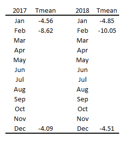
So how did that great scary spike of alarming warming at Halley appear? Let us have a look at the monthly mean temperature record for 2017 and 2018:
Well there you go. Being down under the seasons are reversed so the warmest part of the year is Dec – Feb and temperature attained during this period is what has been recorded. Nothing whatsoever was recorded for the cooler period of Mar – Nov, so if we calculate the annual mean and use it in an analysis we are going to get more bias than you can shake a stick at. This is more than your common-or-garden bias, this is bad-ass base bias and Antarctica is swimming in it (so as to speak).
Muck Raking
So then, we started out with 56 bases but we’ve discovered huge holes in the data records sufficient to warrant exclusion from any serious analysis. If I now go over my spreadsheet and extract bases hitting the nominal 50% daily capture target then I end-up with just 38 juicy bases that are worthy of plucking, peeling and stewing. In terms of location (distance to the nearest coast) the four-way breakdown now looks like this:
coastal (0 – 20km) – 29 bases
inland (20 – 200km) – 5 bases
interior (200 - 1000km) – 1 base
deep interior (>1000km) – 3 bases
Let’s Get Baking!
Now that we’ve wiped the surfaces down and mopped the floor let us get our aprons on, sift the flour and start baking some time series plots...
Kettle On!


Very illuminating. I hadn't given proper thought to the difficulty of obtaining readings in such extreme conditions nor to the question of location, despite being well aware of location as a critical factor in more benign environments. Now you have pointed this out it is so obvious that I will need to have a talk to myself to find out how I failed to think critically. I look forward to learning more.
There’s an extensive description of the climate at Orcadas Base on Wikipedia
https://en.wikipedia.org/wiki/Orcadas_Base
It’s almost as if they’re expecting lots of tourists.
That plot of mean temperatures 1901 to 2007 starts lower left and ends upper right. I wonder why they haven’t updated it since 2007.