
Singin’ In The Rain (part 4)
Storms also make us wet, so I decided to take a look at how wet the UK has gotten these past few decades…

In part 3 of this series we had a look at the distribution of holes in the daily rainfall data over time only to discover a troublesome period spanning 2002 – 2012, this being most curious! As a result I went away and had a think about the strategies I could adopt.
With only nine long-series stations in the sample I’m loathe to exclude more of these and so started out in favour of hole-filling. There are many ways to do this starting with simple substitution using some form of mean value, moving through to linear interpolation and various forms of statistical modelling, including use of fancy techniques held within the missing value imputation module of my stats package. This is a rather sexy beast in which several data series can be used conjointly to derive likely missing values. Here’s what the stats manual has briefly to say:
The purpose of multiple imputation is to generate possible values for missing values, thus creating several "complete" sets of data. Analytic procedures that work with multiple imputation datasets produce output for each "complete" dataset, plus pooled output that estimates what the results would have been if the original dataset had no missing values. These pooled results are generally more accurate than those provided by single imputation methods.
Thus, you can order up multiple guesstimates and use these in a pooled manner. Normally five guesstimates are used but if the data are amenable (i.e. it is behaving itself) this can be reduced to just three layers. The question arises as to what constitutes ‘good behaviour’ and this is where factor analysis comes in for we really need to know if stations ought to split into subgroups. The most obvious divide is between the rainy north of England and the drier South, but we might ask where Ireland sits: does it follow the patterns of the rainy north or does it exhibit its own special pattern of wetness over time?
After settling on an approach and settling on the period Jan 1920 – Nov 2023 I relented and threw both Buxton and Eastbourne back into to pot to see how these fared; this giving us a sample of 11 long-series stations ripe and ready for imputation. The period 1 Jan 1920 – 30 Nov 2023 yields 37,955 daily records and both Oxford and Rothamsted came close to providing this with 37,931 and 37,903 records respectively. This scattering of very few holes was subject to linear interpolation of the daily time series to provide a solid data record.
All 11 series were thrown into a classic factor analysis using principal components with varimax rotation. A total of two eigenvectors were extracted with a cumulative 61.3% of variance explained, making things nice and neat. What this gobbledegook is saying is that there are essentially two groups of stations in terms of rainfall patterns over time and these are split as follows:
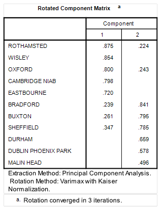
Thus Rothamsted, Wisley, Oxford, Cambridge (NIAB) and Eastbourne all score highly on the first component eigenvector, with Bradford, Buxton, Sheffield, Durham, Dublin (Phoenix Park) and Malin Head all scoring highly on the second component eigenvector: there’s your split right there, and using an objective method to boot! We may note that Dublin and Malin Head didn’t branch off to form a third group, though their scoring puts them at the bottom of the table. We may splice these, if we so wished, in order to tighten up analysis but the gobbledegook says we can go ahead and consider them as wet and windy northern stations.
This split is vital if we are use the missing value imputation module in a sensible manner rather than abuse it for it ensures we crunch like-with-like when it comes to hole filling.
But Did It Work?
Yes, but don’t take my word for it – have a look at the following tables summarising how the data looks in terms of the original series, the three imputed layers and the final, pooled layer:
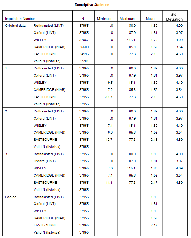
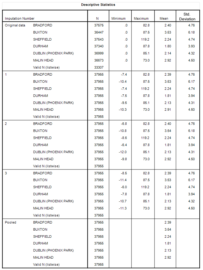
What we are looking at here is stability and consistency between raw series and imputed series for the South and North station clusters that gives me a high degree of confidence that all holes have been filled sensibly. We may thus proceed to derive monthly and yearly aggregate means for each regional cluster to get a grip on rainfall in these two distinct regions for the period Jan 1920 – Nov 2023 with full data coverage: a tasty prospect indeed!
Has It Been Worth The Effort?
All depends on whether those holes introduced significant bias or not. Let’s get those crayons out and compare the raw data series with the imputed data series for southern and northern clusters:
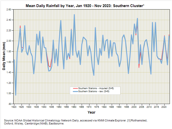
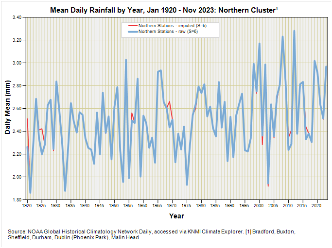
If I’m being honest we are talking tiddly widdly tweeking rather than anything of significance but I have enjoyed the process and it has kept me off the streets. The thing is that we started out with reasonably decent data and the odd hiccup hasn’t introduced much bias, which is a blessing! At least we now know that.
Arguably what is of greater significance is the apparent difference between southern and northern clusters: there appears to be a slight upward trend for the northern cluster but not for the southern and I shall be exploring this in the next episode.
Kettle On!
I can’t see the long hot (rainless) summer of 76 in those graphs... did the other months compensate?
Michael Mann awarded $2 plus $1,000,000 because the hockey stick graph is true science. https://www.science.org/content/article/jury-rules-climate-scientist-michael-mann-long-running-defamation-case?utm_source=sfmc&utm_medium=email&utm_content=alert&utm_campaign=DailyLatestNews&et_rid=701775188&et_cid=5094239