


Climate Change & Climate Variability (part 1)
Hot weather is due to CO2. Cold weather is due to CO2. Heavy rain is due to CO2. Drought is due to CO2. Today I look at the variance inherent in the HadCRUT5 global mean temperature.

It’s a funny old world. As a young thing the big climate scare hitting the front page of all the important publications was an impending ice age. Scientists were pretty certain about this and they blamed the beginnings on instability of the jet stream. Yep, that’s right, the same instability that they have recently adopted to explain global warming. Global warming didn’t pan out as planned despite some very good efforts at data tampering, and so we got lumbered with the catch-all of Climate Change.
This was a very shrewd move because pretty much anything and everything could be blamed on what are essentially unpredictable weather events. In the near future I’m expecting UK folk to put their umbrellas up and exclaim that it is climate changing a great deal today! Equally, those managing to find a spot on Blackpool sands on a sunny August bank holiday will be rubbing sun tan oil into torsos and exclaiming that it is climate changing a great deal today!
Laugh we might but one friend has already reported the following conversation between two people during a period of heavy rain down here in the West Country where rain is an integral part of life:
Person A: “Oh, no, it’s that bloody climate change!”
Person B: “No, it’s just raining like it always does.”
There you go. Programming is in full swing, and those who are easily programmed tend to be those who fail to realise it… but that's another tall story for another day from back when I was formulating my neurobiology PhD.
So what to do with a concept as slippery and ill-defined as climate change? Well, the statistician in me realised we are essentially talking about variance when we witter on about climate change. Everybody understands what is meant by the average of something (a.k.a. mean) and you’ll see these values splattered all over anything related to climate. We’ve got mean rainfall, mean sea level, mean hours of sunshine, mean cloud cover and, of course, mean temperature (amongst a zillion other things). Yet this is only one half of the statistical picture, for with each calculated mean there comes another property and that is the variance, this property of the data sample being intimately related to the standard deviation and the standard error. If climate change is indeed a thing then we are going to see variance rising over time in pretty much any measure we care to… er… measure. Here’s my crafty idea in a nutshell:
‘Climate Change’ by its very definition implies magnification of the variance inherent in any climate-related variable over time, and this can be assessed using formal statistical methods.
So let’s jump into the deep end with the variable that dominates pretty much every media headline: temperature.
Variance In Global Temperature
For this tray bake I am going to use our old friend the HadCRUT5 global temperature anomaly. Keen readers can obtain this data for themselves via this link. This state-of-the-art dataset offers monthly values that get going in January 1850, with the latest records showing for March 2024 at the time of writing.
What I am going to do with these 2,091 monthly records is boil them down into annual means and their standard deviation then throw 2024 in the bin so that we’re looking at 174 wholesome and fully ripe years only. Let us start straight in with a very familiar slide:
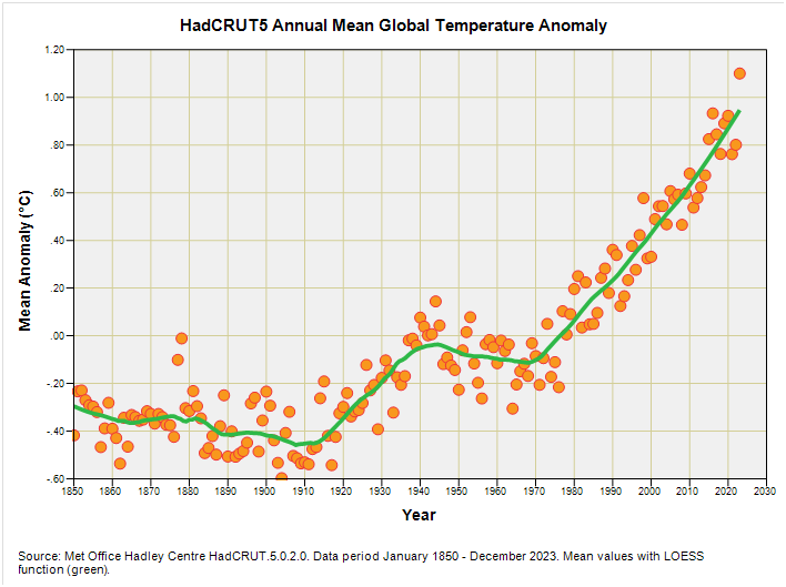
There it is – arguably the most famous graphic in all of climate science - being the mean annual global temperature anomaly as estimated by the bods at the Met Office Hadley Centre. I haven’t bothered with a linear trendline because that runs roughshod over some interesting features that the locally estimated scatterplot smoothing function (LOESS) has wheedled out.
That cooling from 1940 to 1970 is a little awkward, and those of us with our eyes on the science will already have noted that the authorities are trying their very best to get this bump ironed out – they’re squashing it as it is. I fully expect that awkward bump to be gone within the next couple of years as well-funded teams race to re-write meteorological history under the pretence that they’re refining the data and their methodology. Those same teams will also be studiously ignoring the urban heat island effect, poor siting of Stevenson screens and poor maintenance of the same. Then there’s mighty funny business going on with sea surface temperature, revelations of which can be found down in my archives.
So let us put the annual mean down and pick up the standard deviation around the annual mean. As stated, if climate change is a real and scary thing, then we should be seeing greater variability in the global temperature record over time. Except we don’t:
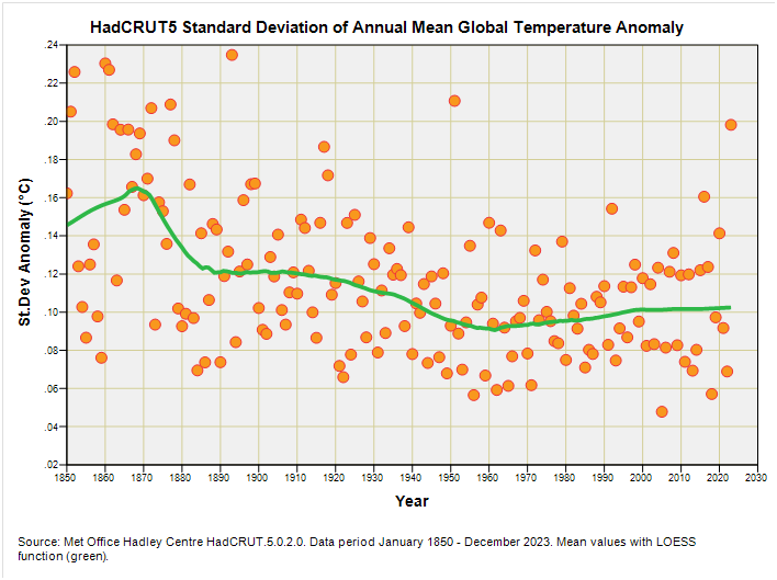
My eyeballs are telling me that the standard deviation of the mean annual HadCRUT5 global temperature anomaly has been declining over time. If I run a linear regression on this I discover a highly statistically significant negative trend of -0.035°C per century (p<0.001), though the LOESS function once again reveals something more interesting is going on: that steady decline from 1890 to 1960 appears to have come to a halt.
From 1960 onward we appear to have stasis in the variability of the global temperature anomaly. This isn’t exactly supportive of the notion of climate change in terms of claims of wilder and wackier. What it does suggest is the temperature of the planet is steadily and quietly increasing over time (assuming the source data are fit for purpose) without the attendant wild swings that alarmists are trying hard to sell us through a compliant media.
Enter CO2
At this point we can make another play for the ball by asking if there is a relationship between the standard deviation of the mean annual HadCRUT5 global temperature anomaly and the mean annual atmospheric concentration of CO2 (please refer back to this article for details on data sources). If excess CO2 is indeed driving the climate as claimed then climate change, as defined by enhanced variation in the global temperature record, should correlate positively with the mean level of CO2. Except it doesn’t:
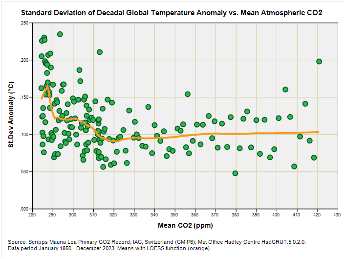
Here we have another jam doughnut without the jam. Except matters are worserer than no jam… a Pearson bivariate correlation fetched-up as negative and highly statistically significant (r = -0.307, p<0.001). Whoops-a-daisies! To be honest, fair and truthful that backward facing result is an artefact arising from early wobbly records that got themselves settled down and dusted with caster sugar by 320ppm or thereabouts (i.e. around 1960). If we focus on the scatter from 320ppm onward we don’t see a thing worth mentioning. I’m afraid alarmists will have to resort to soup throwing again.
Cogitation & Coffee
I’ve used a state-of-the-art dataset (HadCRUT5 global temperature anomaly) for the period 1850 – 2024 to examine this aspect of climate variability over time. If the notion of climate change means anything at all it surely means things are getting wilder and more variable; except that when it comes to global mean temperature this ain’t the case.
We are left with a paradox of a steady climb in mean temperature without an attendant climb in temperature variability, but what could this mean? Given our climate here on Earth derives from strings of weather events then we’d expect wilder weather to be pushing temperatures higher, and then lower if the Arctic jet stream destabilises (polar vortex). In turn this would inflate derived values for statistical variance, yet this is not the case. I therefore conclude that whatever is causing the mean global temperature to rise is not weather-related.
It may possibly be, by way of example, the urban heat island effect come to bite us in the bum for not acknowledging this properly. It may also be deterioration in Stevenson screen maintenance and siting as noted by some wot know their onions. Thus the weather may well be doing what it has always done but we’re becoming total rubbish at data collection, quality control and processing. Here’s one corker of a screen that I found with my own fair hands:

Next time I’ll be grilling another key climate variable – stay tuned!
Kettle On!
We just had this report in Cape Town by our very own Climate Alarmist brigade, the Daily Maverick who have their "Burning Planet" section and the entire paper goes under the self proclaimed Defend Truth epithet - the report entitled "THERMAL INEQUALITIES", can you believe it? LOL!
So here is what they found: "A key takeaway was that neighbourhoods with densely packed buildings and no trees had temperatures of as much as 15°C higher than cooler neighbourhoods, while vegetation, shade and building materials can reduce surface temperature by more than 10°C". They are quick to blame Climate Change on one hand, but seem to definitively prove massive urban heat island effect on the other. Clowns.
I was intrigued if unpredictability was increasing, as so often claimed, it is unpredictability that messes us up because we can't prepare for the heat, wet, cold etc. So my approach was to graph the difference between one year's temperature, or rainfall, record and the previous year's.
I used the UK's Met Office records. https://www.metoffice.gov.uk/hadobs/hadcet/data/download.html and https://www.metoffice.gov.uk/hadobs/hadukp/data/download.html
So for instance 2022's mean temperature was 10 deg C and 2021's 10.3 so I record that as a drop of 0.3 for 2022. Obviously the larger the gains and drops the more "unpredictable" the weather is.
I think you can guess the results - see https://www.sarsen.org/2023/12/unpredictable-weather-not-unprecedented.html
I would be interested in your more scientific thoughts.
(There was an odd 60 year pattern in the Mean spring temperatures - https://www.sarsen.org/2022/12/is-this-years-tumultuous-weather-set-to.html )