Bend It Like NASA (part 2)
A quick look beneath the sleek exterior of super smooth global gridded temperature anomalies reveals a pretty sorry bunch of data
I left part 1 of this mini-series at a bit of a cliff hanger, promising something fancy to determine whether we are looking at a smoking gun of increasing rates of missing winter temperature records over time at 21 super-long series GHCNd stations that would serve to generate fake warming. Herewith that something fancy…
Something Fancy
Between Jan 1880 and Jul 2023 there are 1,723 monthly records in the pot and I have derived the total dodgy day count for each month. I have boiled months down into a 4-level factor representing the seasons (Dec-Feb, Mar-May, Jun-Aug, Sep-Nov) and I have also boiled 144 years down into a 5-level factor representing key collection periods: 1880-1934 (pre-war); 1935-1949 (WWII); 1950-1989 (post-war); 1990-1999 (early IPCC); 2000-2023 (hyper hysteria).
What I can do with this lot is run a generalised linear model (GLM) using a Tweedie distribution to determine if the dodgy day count varies significantly across these two factors (main effects) as well as their interaction. If the interaction terms pops up as statistically significant then this would point to a smoking gun in that winter records are increasingly going missing.
Despite the lengthy preamble into this fancy technique the results are to be found in a very modest table:
Over in the column marked ‘Sig.’ we can confirm a highly statistically significant difference between data periods (p<0.001) and between seasons (p<0.001), but we should note failure of their interactive term Data Period * Season to reach statistical significance (p=0.703). We may conclude that there is no smoking gun and that land surface stations have always found it tricky to measure temperatures during winter. This makes total sense and we have seen this before with Antarctic bases. Whilst it is a relief to determine that nothing murky is going on we are left with a rather nasty problem in that winter temperatures don’t tend to make it to the data record, and especially so if the winter is severe. The word is bias!
Now, the geeky nerds among you will mutter something about contrasts so I shall paste two more tables. Here is the table for seasonal effects:
What I’ve done here is use spring as the reference and we can see that there’s essentially no difference between spring and summer dodgy day counts (p=0.368). There is a hint of a difference between spring and autumn dodgy day counts (p=0.053), with the autumn count being slightly higher (+1.10 days per month). The big difference here is what we’ve already seen and that is the hike in the winter dodgy day count (p<0.001; +2.50 days per month).
Arguably more interesting than seasonal effects is this table for the five data periods. For this contrast analysis I’ve used 1880-1934 as the reference period:
We observe a statistically significant hike in dodgy days during WWII (p<0.001) to the tune of +4.02 days per month, and nothing of consequence when comparing the pre-war and post-war periods (p=0.180). Neither is the early IPCC period of 1990-1999 really getting up to anything much (p=0.078). All changes when we start looking at the last two decades (p<0.001), with an overall mean hike of 11.64 missing days per month compared to the pre-war ‘norm’.
I don’t know about you but this is not exactly filling me with confidence and I wonder about the state of data records for the 40,136 GHCNd weather stations dotted around the globe. We should note that upon all this rests that fancy pink global anomaly map from NASA. It’s not that pretty under the bonnet!
Two Tricks
At this point I can try a couple of statistical tricks. I can run a weighted linear regression to adjust for variations in record keeping over time, and I can try my hand at estimation of missing values on a station-by-station basis. The first is dead easy to do and offers a comparison for cogitation so let us start with this trick.
Just to ensure we are all up to speed I shall start by reminding folk that I derived a variable called dodgy day count, this being a flag that marked days when the number of super-long series of GHCNd stations contributing to the land surface temperature record dropped below 20 - a loss of 1 station in 21 was forgiven but not 2! These daily flags were then summed on a monthly and annual basis to give a total count of dodgy days.
Over the period 1/1/1880 – 31/7/2023 the total annual dodgy day count for the super long series stations ranged from 1 to 337, with a mean of 39.92 per year. The inverse of this variable can be used to provide a weighting score such that a year with only 1 dodgy day gets a weight of 1.00 and a year with 20 dodgy days gets a weight of 0.05. There are, of course, a myriad of ways to produce a weighting factor but I decided on this very basic approach because it is easy to grasp.
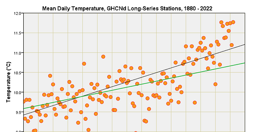
Let me reveal what happens to the warming trend for the mean daily temperature series with and without this weighting factor applied:
We now see that less emphasis is placed on temperature values obtained over the last two decades. The unweighted warming trend that was estimated at 1.19°C per century (p<0.001) has fallen to 0.77°C per century (p=0.014) with weighting. That’s quite a change, representing a 35% decrease in the estimated warming rate, and all because we have decided to account for variation in the daily data capture rate across 21 super-long series stations.
You are not going to see this sort of technique applied in the field of climate science because it is going to dilute the alarmist narrative and bring into sharp focus just how scant and unreliable the raw data really are, being the very data upon which NASA and others build their fancy global maps. Despite claims by talking met heads yaddering on about strict protocols, calibration and whatnot, the fact of the matter is that land surface temperature data quality is lousy. This shouldn’t come as a surprise to anyone who has realised weather stations were established to record local and regional weather for local and regional purposes rather than form part of a sophisticated network of highly-specified and well-placed instrumented observatories designed to detect subtle changes over time across the globe and with extreme accuracy.
That just ain’t so, and climate scientists are having to make do with what hotch-potch has evolved over decades; hence all the fiddling and fudging that is kept hidden from view under the bonnet of gridded, homogenised and re-analysed data products.
In The Flesh
Weighting in some form is one way of adjusting for varying data quality, another is to don a pair of Wellington boots and go wading into the raw data to see if any holes can be plugged. A few holes here and there are easily filled using linear interpolation or other methods but if the holes are large, non-random and/or numerous then we’re really on to a hiding for nothing.
To get a feel for just how hole-laden data records are for the 21 super-long series GHCNd stations for the period 1/1/1880 – 31/7/23 I excluded any years with less than 365 daily observations of the mean temperature, this threshold being lowered to 212 days of data to cover the part year period 1/1/23 – 31/7/23. Yes indeed, I agree that this is very cruel and unrealistic, but it will give us some idea of just how reliable the land surface temperature record really is before NASA and others get their hands on it to forge an iced fairy cake or two. Herewith a summary of results station by station for the 144-year period 1880 – 2023:
I confess to being shocked, especially by the venerable station at Oxford, which has been chugging along since 1815, and has yet to manage a complete year of data collection without interruption. Durham and Stornoway airport are also venerable UK stations that are not capable of uninterrupted daily data collection. Poor show, I say! In contrast, the Austrians have put in a jolly good show with 140 complete years out of 144 for Wien (Vienna) and 135 complete years out of 144 for the station at Kremsmünster – these are places we might consider visiting for decent coffee and cake! The Germans also fare rather well with all six stations managing to clear 130 complete years and more. The upshot of this meteorological fastidiousness is that Germany and Austria are going to dominate the global land surface temperature record when it comes to long-series analysis.
Griddled Plots
Save for a handful of stations there are going to be far too many gaping holes to fill for the purpose of this short and sweet study, so I’m going to abandon this idea. Organisations like NASA don’t abandon things and, instead, resort to statistical modelling, smoothing, extrapolation, interpolation, re-analysis and all manner of gridding trick to paper over the many cracks. Those fancy global maps you see are not observations but statistical extrapolation on steroids. We ought to call them griddled plots to acknowledge the level of book cooking that quietly takes place.
It is sobering to think that this handful of long-series GHCNd stations I’ve been poking at are what will become a comprehensive and rather glossy global land surface temperature anomaly at the hands of NASA bods and the like. Naturally, the public will assume they are ogling at something utterly robust and totally reliable when it is nothing of the sort. As I have said, the raw data quality from land stations is lousy and upon this climatologists build their church.
What I am minded to do for the last episode in this mini-series is plot a few slides for those stations managing to achieve half-decent data capture in any one year. This will definitely require some form of nourishment!
Kettle On!
Great stuff!
There was also a very interesting talk on Tom Nelson regarding the accuracy of global temperature measurements.
https://youtu.be/0-Ke9F0m_gw?list=PL89cj_OtPeenLkWMmdwcT8Dt0DGMb8RGR.
I am struggling to understand exactly what the 'temperature anomalies'. OK it makes sense to to compare the change in temp relative to a reference period at each station. That way we can compare a
of station at sea level with one at altitude.
However, what happens when new stations are added starting at some later date than the reference period?
Also, as you have been showing here, what happens with missing data. My limited understanding is that when data are missing, it is estimated from the 'anomaly values' at adjacent stations.
It would be great to have some sort of precise of how these temp eg HADCRUT, NASA GISS etc series are derived by the various organisations, how their adjustments are made, and whether these methods are statistically sound. Just a thought?
Remind me what counts as incomplete. When I looked at that Antarctic data I found cases where Tmax was present, but no Tmin as well as missing both data and the occasional way out of line figures (e.g missing the negative sign off). To my mind there is no point in using faulty or incomplete data but any data cleaning should leave an audit trail of the adjustments: beforedata + adjustments = finaldata. Does anybody do this? Those meticulous Germans and Austrians perhaps?