Antarctic Sea Surface Temperature (part 1)
I take a look at sea surface temperature for 60 – 90° South to find rather patchy data and a rather complex situation
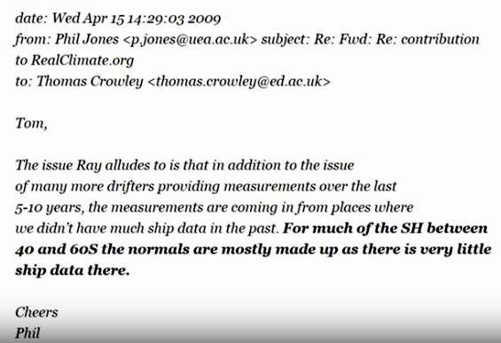
Before we begin we better let Professor Phil Jones of CRU/UEA tell it like it is in one of those leaked emails that dropped out of the climategate scandal that quickly got dismissed as trite nonsense by all the usual suspects:
Shipping down in the southern hemisphere isn’t as thick on the ground (better make that water) as it is in the northern hemisphere for pretty obvious reasons, and so when it comes to sampling the temperature of the seas down near Antarctica we don’t stand much of a chance of getting any decent historic data. The issue is apparent for latitudes of 40° to 60° South let alone 60° to 90° South, so what data do we have and what story does it tell?
Masters of observed sea surface temperature (SST) either reside at the Hadley Centre, UK or the National Center for Atmospheric Research, USA. The former have data going back to 1850 (HadSST4) whilst the latter have data going back to 1662 (ICOADS). Both are gridded products in that you can select any oceanic region for study. Here’s the introductory blurb for each product:
HadSST4
The Met Office Hadley Centre's sea surface temperature data set, HadSST.4.0.1.0 is a monthly global field of SST on a 5° latitude by 5° longitude grid from 1850 to date. The data have been adjusted to minimise the effects of changes in instrumentation throughout the record. The data set is presented as a set of interchangeable realisations that capture the temporal and spatial characteristics of the estimated uncertainties in the biases. In addition there are files providing the measurement and sampling uncertainties which must be used in addition to the ensemble to obtain a comprehensive estimate of the uncertainty. The data are not interpolated. The data set initially runs from 1850 to present with regular monthly updates.
The SST data are taken from release 3.0.0 of the International Comprehensive Ocean-Atmosphere Data Set, ICOADS (external web page), from 1850 to 2014 and from ICOADS release 3.0.1 from 2015 onwards. From January 2016, these are supplemented by drifting buoy observations "Generated using E.U. Copernicus Marine Service Information" from CMEMS (Copernicus Marine Environment Monitoring Service). HadSST.4.0.1.0 is produced by taking in situ measurements of SST from ships and buoys, rejecting measurements that fail quality checks, converting the measurements to anomalies by subtracting climatological values from the measurements, and calculating a robust average of the resulting anomalies on a 5° by 5° degree monthly grid. After gridding the anomalies, bias adjustments are applied to reduce the effects of changes in SST measuring practices. The uncertainties arising from under-sampling and measurement error have been calculated for the gridded monthly data as have the uncertainties on the bias adjustments following the procedures described in the paper.
ICOADS (International Comprehensive Ocean-Atmosphere Data Set)
The International Comprehensive Ocean-Atmosphere Data Set (ICOADS) offers surface marine data spanning 1662-present, and simple gridded monthly summary products for 2° latitude x 2° longitude boxes back to 1800 (and 1°x1° boxes since 1960)—these data and products are freely distributed worldwide. As it contains observations from many different observing systems encompassing the evolution of measurement technology over hundreds of years, ICOADS is probably the most complete and heterogeneous collection of surface marine data in existence.
I get rather excited reading these, so Professor Phil Jones’ confession is a bit of a downer. That being said he was talking about historic data so surely we should have something decent to look at from WWII onward when meteorology became an important science in pretty much every corner of the globe, and when shipping stuff to and from those corners became a hairy business.
Aside from observed data, which originates from ships and buoys, there is reconstructed SST offered by modelling bods at NOAA (ERSSTv5) and the Hadley Centre (HadISST), so we might as well have a look at these whilst we’ve got the oven on.
There’s A Hole In My Bucket
Back in the days of the ancient mariner ships used to tow a wooden bucket with a wet bulb thermometer in it to determine the sea surface temperature, these days they use a probe in the inlet valve. With coffee on the brew let’s have a look at that worrisome confession of Professor Jones to see how much substance there is to it.
What I’ll do is define the oceanic region that falls at or below 60° South and pull down the latest and hottest HadSST4.0.1.0 dataset from the Hadley crew to see how many raw observations they’ve gathered since 1850 (the Hadley crew hold more observations on SST through the ages than anybody else). Herewith the result in fetching blue, and with a fancy logarithmic y-axis:
That linear trend upward indicates an almost perfect exponential rise in the number of observations being made over time. We may note the gap caused by two world wars and the rather patchy nature of measurements made before 1900.
Given that the global oceanic region at or below 60° South is utterly vast, how confident are we that ten measurements a year are going to capture what is going on each month for all oceanic regions in a representative manner?
The answer is not very, and I would argue that even 1,000 measurements per year aren’t really going to cut the mustard for such a vast and variable oceanic region. What we have are tiny little pockets of data gathered within popular shipping lanes and at buoys that are easy to service. Upon this house of cards sits a great deal of climate science.
Data Despondency
I think I’m even more despondent after plotting that slide, so I better act like an alarmist and pretend all is well so I can go and produce the following slide of mean annual sea surface temperature for the sub-Antarctic (60 – 90° South) oceanic region along with spidery whiskers representing ±1 standard error:
Now this is what I call funky! With data as patchy as this we must expect outliers and we’ve got a couple of corkers! Data gathering blossomed after 1980 so the whiskers shrink to nothing. Before then the whiskers can be used to give us some idea of what to seriously consider and what to chortle at: snigger at any single blue blobs and focus on the cleaner shaven points rather than the hairy fairies.
If I do this my eyeballs suggest a cooling dip from 1890 down to 1930, followed by a warming phase from 1930 to 1980, thereafter followed by relative temperature stability. If I grit my teeth and force a linear regression through this lot I discover an insignificant warming trend of 0.1°C per century (p=0.674). If I run that linear regression again but this time weight the data points by the number of observations then I arrived at a statistically significant warming trend of 0.2°C per century (p=0.020). Though alarmists might cheer this is an utterly meaningless figure for we are mixing measures derived from modern methods of data collection with those of not just a few decades ago but those back before the turn of the nineteenth century.
Let us suppose we only got our buckets into gear come 1980. What then? Well, our weighted linear regression coughs up a marginally insignificant cooling trend of -0.5°C per century (p=0.062). This is cherry picking territory so if I move the start date to 1990 then we’re back to an insignificant warming trend of 0.5°C per century (p=0.141). If I want to go full steam ahead alarmism I can choose 1920 as my start date, turn weighting off, and generate a highly statistically significant warming trend of 0.9°C per century (p=<0.001).
Homogeneity & Hoodwinking
The latter figure is sure to attract one or two eco-journalists like flies to a cow pat, who will studiously ignore the fact that cherry picking is used by climate change alarmists as well as climate change deniers. But the issue goes deeper than just cherry picking start and end dates.
In this animated explanation of how cherry picking is used by climate change deniers we should note that zero mention is made of the validity of considering a time series to have arisen from a homogeneous process. In plain English, we are assuming that measurements made 1880 - 1920 are equivalent to those made 1920 - 1940 as well as 1980 - 2020. This may not be the case, and I am sure readers will be able to think of a vast list of potential confounding factors when it comes to sea surface temperature measurement.
Thus, when we look at any lengthy time series in climate science, the first question we need to ask ourselves as statisticians is whether numerical treatment of the data as a single homogeneous entity is valid. Climate scientists are not statisticians and tend not to ask such a thorny questions for such questioning might reveal a rather embarrassing situation. It should come as no surprise that Wiki, being an institutionalised and heavily manicured public resource, is a source of hoodwinking par excellence.
If I had to stick my neck out and guess what was happening to the surface temperature of the far southern oceans I would suggest they are oscillating around an annual mean of close to zero degrees.
Comparison Of Sources
It might make sense at this stage to consider the four big datasets mentioned, so here they all are in two time series plots of annual mean values:
As regards sea surface temperature we’ve got the Hadley Centre observations in the blue corner and ICOAD observations in the green corner. The first thing to note is the extraordinary divergence for mean annual values prior to 1970. What is bizarre is that these organisations will be using the same source data though, as climategate revealed, there isn’t much data for anything below 60° South. This is a bit of a shocker and has certainly taken the wind out of my sails! NOAA’s ERSST crew would have you thinking the Antarctic oceans were much cooler in the past but the Hadley mob say that ain’t necessarily so!
The bottom slide makes me feel a little easier with generally good agreement between both sets of anomalies from 1900 onward. I find those extreme peaks a little suspicious and they may well point to scarce data. If we ignore them it sure looks to me like Antarctic waters have not been warming over time but go through a series of alternating warmer and cooler phases.
Madcap Amalgam
After overdosing on flapjack and coffee I decided to try a madcap amalgamation. All four data series possess 100% data capture for 1946 – 2021 so I decided to use this 76-year period as a mega-period climate normal to derive four sets of SST anomalies. Yes indeed, I’m deriving anomalies for anomalies, which may sound molto wacko but which makes arithmetical sense. Here’s what these four series look like:
Things are starting to shape up so I went one stage further and derived the mean anomaly for all four series. Try this for size:
I’ve added a LOESS function (green line) to guide the eye and I’ve plonked a grey dashed line down to mark 1946, being the onset of more comprehensive data collection. Anything to the left of this is to be treated with utmost suspicion (though not according to the Wiki entry about cherry picking).
Again, if I had to guess what was happening I’d say we’re looking at something cyclical rather than a linear warming trend. There does indeed appear to be warming from 1930 through to 1980, with cooling from 1980 through to 2015. Quite what is happening in recent years is hard to judge because methods have rapidly changed with the deployment of fancy automated buoy arrays and satellite-based measurement. Whenever you see a hump, bump or trough in a time series it’s always good to ask if definitions or methodology has changed, for it invariably has.
Are we looking at a time series proper (one that arises from a homogeneous process in which all things are equal) or a hairy fairy collation of methodologies that confound matters?
Kettle On!
Fascinating stuff. In the dataset can you see the precision of the recorded numbers. Was it to 1 decimal place or nearest whole number? Were they always in Celsius or originally Fahrenheit and converted to Celsius. Presumably in the days of bulb thermometers in wooden buckets, depth might have added to the variability.
I'm not sufficiently knowledgeable to judge, but my experience of reading studies in various subjects I do know about makes me think it is falsehoods camouflaged with gobbledygook. e.g. define a parameter that based on known data confirms the hypophysis, or fake the data.