A Fresh And Fruity Look At Spring 2024 (part 1)
The Met Office are trying to convince us that it was well and truly warm this spring despite folk resorting to Norwegian socks, hot water bottles and bobble hats, so I took a peek at some data.
Hopefully readers will have already seen my recent rant on Substack Notes. Entitled Cheque Book Science: A Note, these tetchy words tell the tale of the demise of old-school science from my angle as a G7 government scientist in the thick of it back in the ‘90s. If you haven’t read the note please do, for it might cough-up a missing piece of the jigsaw for you.
BTW If I’m going to rant – or even share recipes – then Substack notes is where you’ll find me, so it’s worth keeping an eye out from time to time.
Now a rant is one thing but it ain’t science. For that we need tray bakes, and so I decided to whip-up some fresh and fruity tray bakes for us all based on the screenshot that got me growling yesterday. Here’s that screenshot again:
There are a couple of larders I could raid, so after a refreshing hot lemon tea I decided to turn to KNMI climate explorer and pull down all weather stations in the UK that are part of NOAA’s Global Historical Climatology Network Daily database (GHCNd). There are 152 of these with suitable historic temperature records, the most venerable being the station at Oxford whose data record stretches back to 1815. This is rather surreal for we are talking the Napoleonic wars and the Battle of Waterloo.
Not So Many Cherries
Not all stations have gathered data for that length of time, with only 9 stations offering records dating back to 1900 and just 17 with records dating back to 1920. If we are being honest about this (and it’s high time we should be) then 1960 is when data collection really got cooking in the UK with just 49 of those 152 (32.2%) stations possessing data records prior to that year.
Truth be told we don’t have much antique temperature data here in the UK in the first instance, but even this is not the whole sorry story, for out of those 103 stations with data records from 1960 onward only 68 have managed to keep data collection going continuously through to 2024. Please remember this when some expert uses the well-worn and utterly abused phrase, “since records began”, which should be your cue to ask how many records and since when, and whether the station sample changed over time in any way. Since records began tells us nothing about data quality, data capture, sample size and sample consistency.
What I’m going to do now is ignore these fine points of statistical rigour because that’s what the Met Office does. Indeed, I think it fair to say that the Met Office is now in the business of entertaining the public on behalf of the government rather than conducting truly independent and open-minded research, and I hope you can all now see why. Thus, I shall crunch the daily mean temperature for all 152 stations regardless.
As it happens I chanced upon an interesting discovery when I did this… not many daily records for the month of May for those 152 GHCNd stations are complete and hunky dory. There’s always a delay in data collection and this doesn’t strike me as particularly odd, but what makes me feel a little uneasy is if the Met Office went ahead crunching incomplete data for May like I am about to do without making this clear. This makes me wonder if that strangely vague “warm May and spring” statement on their graphic was written with this in mind. Then again they may well be sitting on heaps of high quality stuff us plebeians don’t get to see.
A Bake At Last!
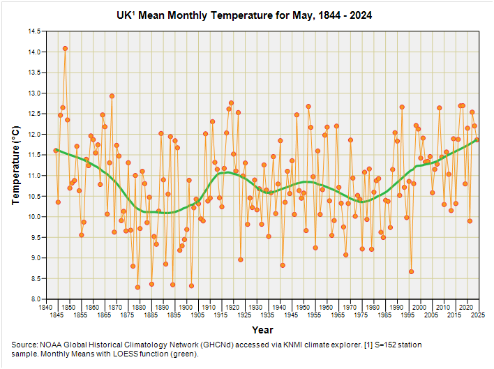
If I crunch the means for the months of May between 1844 and 2024 we arrive at this fragrant slide for the mean temperature at those 152 GHCNd stations dotted across the land:
Interesting innit?
For sure the mean May temperature has been rising recently, but it’s only creeping back to where it was several decades ago. We may ask what the current May mean is and how it historically compares and I shall reveal that, at a mean of 11.87°C, it crossed the finish line in 37th place. The gold went to 1848 with 14.08°C, silver went to 1868 with 12.93°C and bronze went to 1919 with 12.76°C. The modern era just missed out on a medal with 2018 coming in fourth with 12.70°C.
So this is the warmest May on record is it? As always, all depends on precise definitions, how you deal with missing data and how you go about analysing what data you do have, starting with selection of your station sample.
Fresh Baked Anomalies
There’s a bit of fine print on the Met Office graphic by way of “1991-2020 anomaly”. This 30-year period is what is known as a climatological normal and, as I’ve demonstrated in previous articles, you can generate very different values for the temperature anomaly merely by shifting your baseline period.
If we glance at that green snaky LOESS function in the above slide we see that our Mays have been getting warmer from 1975 or thereabouts; thus, a climatological normal placed early in this period will generate larger anomalies. At least the Met Office didn’t perform the dastardly underhand trick of using 1981-2010 as the baseline (though keep your eyes peeled when it comes to NOAA/NASA graphics).
We may ask how the May 2024 mean of 11.87°C fares against the 1991-2020 climatological normal and I can reveal that it is +0.58°C warmer, with the grand mean for the normal period fetching-up at 11.29°C. This anomaly puts it in the pale pink bracket of 0.50 – 1.5°C above normal and in this regard the pale pink shading of the Met Office’s graphic is spot on.
However, this is a national figure based on data from 152 stations combined and so we must wonder how the Met Office managed to derive anomalies as great as +2.5°C and even +3.5°C if nothing negative (pale to deep blue) is showing to balance these out across the nation to yield an overall pale pink.
After a bit of cogitation we realise that each station in the Met Office sample (or cluster of regional stations) must have been used to derive its/their own anomalies otherwise you don’t get a spatial distribution to ogle! This sounds sensible until you realise a leap from -12.0°C to -9.5°C for parts of Scotland back in May would generate a deep ruby colour of +2.5°C even though it was still brass monkeys. Anomalies are not absolutes!
What the Met Office graphic is telling us, therefore, is that everywhere was warmer than it normally would have been, with ‘normal’ being the period 1991-2020. Anyone experienced at deriving anomalies would instantly realise from my first slide that the graphic was going to be biased toward red and pink colouration ‘coz the underlying trend is positive from 1975 onward.
Spring Time
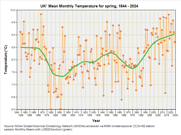
So let’s do this all again for March, April, and May 2024 combined to yield a spring mean. Here’s the tray bake:
A similar story, as we might expect, with spring 2024 temperatures now reaching what they once were. In terms of medals gold goes to 1868 with 9.83°C, silver goes to 2017 with 9.82°C and bronze goes to 2011 with 9.71°C. Spring 2024 managed to cross the line in 47th place with 8.71°C for the… er… warmest spring on record. H’mmm…
So where does the anomaly jobby stand? Well, at a grand mean of 8.71°C spring 2024 comes in at 0.01°C cooler than the 1991-2020 grand mean of 8.72°C. This means the majority of the graphic should have been coloured white with tinges of pink and blue to reveal regional variations. This clearly ain’t the case and so I shall conclude that the Met office are doing something strange and unexpected. We might say that their anomalies are anomalous. Do I hear groans or is that the wind?
Second Helpings
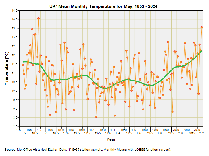
That there GHCNd data is a start but I’m not exactly enjoying the holes for May 2024, so I decided to raid the larder again and pull down a second helping of data from one of my favourite online resources, this being the Met Office historic station data page, which may be found here. On this page you’ll find historic monthly temperature maxima and minima, days of air frost, total rainfall and hours of sunshine for a sample of 37 stations dotted around the UK. Even better is that data completion is 100% for the month of May for the 34 stations that are still operative in 2024.
May Series
A similar story of temperatures getting back to what they once were but this time May 2024 is quite pronounced and not at all bobble hat. In terms of medals gold goes to 1868 with a mean of 14.05°C, silver goes to May 2024 with 13.56°C and bronze goes to 1862 with 13.45°C. As regards anomalies that there 13.56°C for May sits +2.23°C above the 1991-2020 normal of 11.33°C which puts us into deep red on the Met Office graphic. This is all very fascinating because we’ve got far fewer stations in the sample but with better quality data, and my point estimate now squares nicely with the Met Office geospatial analysis.
Spring Series
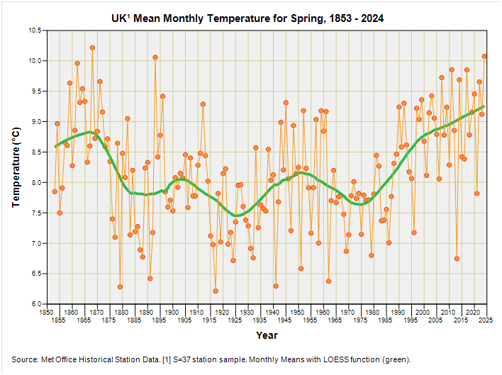
Another story of temperatures getting back to what they once were, but it looks like spring in the modern era is consistently warmer to my eyeballs. This is not surprising given the stupendous differences in urban development surrounding these 37 Stevenson screens over the last 170 years.
In terms of medals gold goes to 1868 with a mean of 10.22°C, silver goes to May 2024 with 10.07°C and bronze goes to 1893 with 10.06°C. As regards anomalies that there 10.07°C for May sits +1.27°C above the 1991-2020 normal of 8.80°C which puts us back down into pale pink on the Met Office graphic for the national norm and I am once again at loggerheads with Met Office analysts.
Coffee, Cake & Cogitation
What I’ve done here, in a rather cheeky manner, is lead my readers around the mulberry bush and back. I’ve been disagreeing with the Met Office analysis and I’ve been agreeing! I’m hoping that this illustrates just how unsettled real science actually is and, in this instance, just how much depends on the exact station sample studied and the quantity and quality of data obtained at those stations. If I applied statistical rigour and only analysed complete records from those very few stations that have been continuously operative from 1900 through to 2024 then I’m going to get different results yet again, and may very well arrive at a different conclusion.
It can be said that there are no truthful answers in science, only truthful intent. In this instance my intent is honest exploration because I’m curious and have the time to fiddle, whereas Met Office analysts will have the government breathing down their neck via a formidable chain of command.
Kettle On!


So despite the implied link to CO2 emissions by the Met Office, May temperatures are about the same as they were in the early 1800s? And no journalist can be bothered to check the data to reveal that.
Are data available to calculate mean of daily maxima in the Mays? I think you’ve made the case before that using maxima reflects whether temps are getting hotter while excluding the effects of nightly warming that plagues the usual mean temperatures.