

Climate Change & Climate Variability (part 11)
Climate Change & Climate Variability (part 11)
We go back over some basics regarding statistical variance within a time series using an inflatable plastic dataset

Back in Climate Change & Climate Variability (part 1) I stamped out what I believed to be a crafty idea:
‘Climate Change’ by definition implies magnification of the variance inherent in any climate-related variable over time, and this can be assessed using formal statistical methods.
I had assumed everybody was with me on this but perhaps not. Once you grasp the nettle on this the cat is out of the stable and the milk has spoiled, so what I thought I’d do today is ensure everybody is up to speed and crisping nicely by running a few simulations to explain what (statistical) variance is, what it looks like, how we go about calculating it, and why it torpedoes the notion of man-made climate change below the waterline. I shall be doing this in best bib and tucker and with good grace as a former G7 head of a statistical modelling section in the service of Her Majesty’s Government. I shall also use my (expensive) professional stats package as well as Excel.
The Beginning
I shall start at the beginning with a very simple (simulated) dataset of just 10 observations, these being: 12.18, 13.93, 13.45, 13.28, 10.29, 10.47, 13.37, 17.27, 13.63 & 13.37. If you break out your trusty hand-held calculator you’ll discover their mean (a.k.a. average) comes to 13.12 (if we stick to 2 decimal places of precision). Let me now pop these down in an Excel spreadsheet and add a few simple calculations that reveal how the variance and standard deviation are derived…
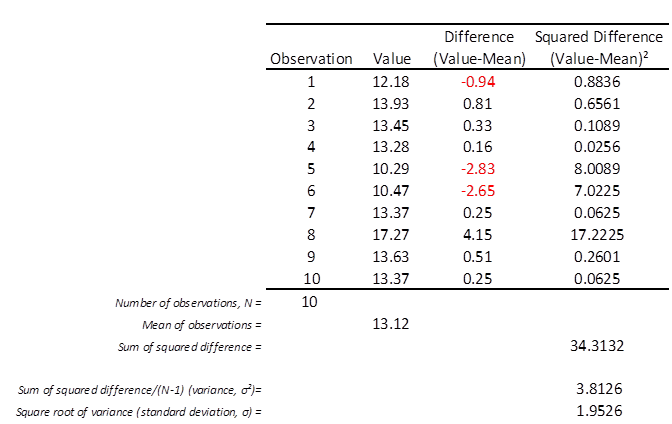
We’ve got 10 observations (N=10) with a mean of 13.12. The first calculation I’ve made is to derive the difference between each observed value and the overall mean, with the first difference fetching-up at -0.94. In the column to the right of this I’ve squared these differences to ensure they offer positive values and only positive values, such that -0.94 becomes 0.8836. Below this column you’ll find the sum of all the squared differences, which comes to a grand total of 34.3132.
There is one more step we must make and that is to divide this grand total by the number of observations minus one (N-1) to arrive at 3.8126 (to 4 decimal places of precision). This is the variance of this set of observations whose symbol is the Greek letter sigma with a little superscript ‘2’, denoting this figure is based on the sum of squares (σ²). To get the standard deviation all we have to do is take the square root of 3.8126 to arrive at 1.9526 (whose symbol is now plain old sigma - σ).
NOTE: The benefit of using the standard deviation is that it fetches-up in the same units as the observations rather than squared units, which would be a bit weird. Readers are bound to ask why we divide by N-1 and not N. This is the convention that is followed to yield an unbiased estimator from a sample, this being known as Bessel’s correction. Buy me a beer, a packet of plain crisps and a pickled egg and I’ll spend the evening in deep explanation that will dredge up degrees of freedom, sample gubbins and population stuff.
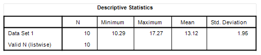
We should all now be able to derive both the mean and the standard deviation about the mean and impress people at parties by sketching things out on a table napkin. If I run these numbers through my pro stats package I’m treated to the following rather thin table within the blink of an eye:
What Does It Look Like?
When it comes to climate studies everybody expects a fancy graph these days. Produce a crappy graph and alarmists will pounce with the claim that a crappy graph means crappy thinking and a crappy conclusion. I once had my work rejected out of hand because of a misplaced comma, but this is the game they play. Produce one iffy graph and your entire report gets rejected, accompanied by sneering remarks about leaving matters to the experts. The queer thing here is I’m the very same fellow who once advised the high and mighty, but I guess getting a pension instead of a pay packet has annulled my expertism. What’s worse is that I sometimes wear odd socks.
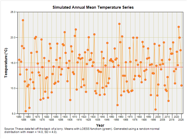
A graph of just 10 observations is going to be pretty boring so how about I churn out 176 observations and call the sequence ‘simulated annual mean temperature’? Cheeky, huh? Here’s what this looks like if I start the clock at 1850:
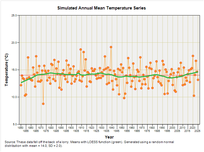
The first 10 values are what we’ve been playing with and the whole sequence was generated using a random number function set to produce normally distributed values with a mean of 14°C and standard deviation of 2°C. Don’t worry too much about what this babble means – it’s all fake stuff wot fell off the back of a lorry. Alarmists wanting to know what LOESS means (locally estimated scatterplot smoothing) can check out this excellent Wiki entry instead of moaning and rolling their eyeballs. Rather then calculate the standard deviation by hand again I’m going to press a button and get my stats software to tell me what we’ve now got:
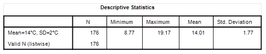
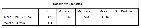
OK, so the mean is pretty darn close to the programmed value of 14°C and the standard deviation of 1.77°C isn’t too far away from the programmed value of 2°C (these latter two values are rarely the same owing to the random nature of randomness). What I want readers to do is drink in the graphical variation they are seeing over time, with particular attention paid to the difference between the values for individual observations (blobs) and the grand series mean of 14.01°C (horizontal red line), for we messed about with the first 10 of these differences and their squares a short while ago.
More Variance, Vicar?
Let us now repeat the process but programme the random number generator to produce a normally-distributed series with the same mean of 14°C but a bigger standard deviation of 4°C:
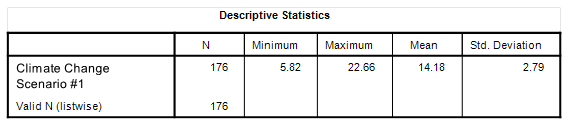
There we are – the same mean (more or less) and a standard deviation that now fetches up at 3.73°C. Now take a look at the graphed variation about that mean and compare it with the previous slide (they’re plotted using a common scale for the y-axis). Chalk ‘n’ cheese innit?
Let Us Assume
Let us assume that climate change in my simulated world started suddenly in 1950. Let us also assume that climate change is leading to wild fluctuations in temperature. Let us also assume that these wild fluctuations are generating record-breaking hot years as well as record-breaking cold years. What would this scenario look like? Well, I can cut & paste together the two simulated series we’ve looked at to produce this combi plot:
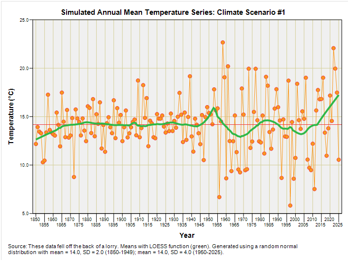
If climate change was creating wilder temperature swings leading to hot years as well as cool years then this amplification of the series variance over time (a.k.a. heteroscedasticity) is something we ought to be seeing all over the place. Except we don’t. No matter how I bake temperature data from different sources all we see is a gradual increase in the mean temperature without an attendant increase in the variance about the mean. You can check this out for yourself by starting back with this article and pulling down the necessary data.
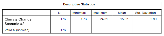
Climate Scenario #2
I’m going to make my scenario a little more realistic by adding a warming trend of 1.3°C per century to the simulation, as estimated by moi from the latest HadCRUT5 global mean anomaly. Here’s what we now have:
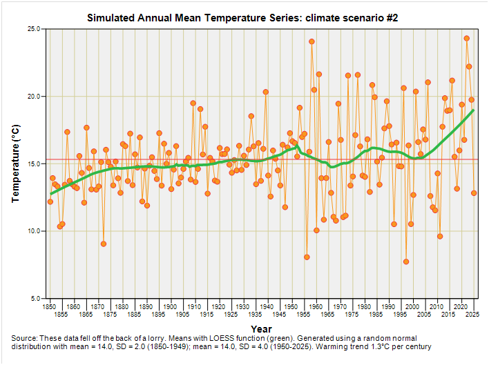
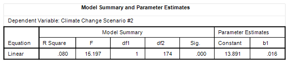
I’ve added a new table at the bottom that is the output from a linear regression that estimates the derived warming rate at 1.6°C per century (p=0.005), with the coefficient for this to be found under the column ‘b1’. This is what climate change as an inflation in variance should more or less look like when set against a backdrop of gradual warming, though with the inflation of variance over time a more gradual process rather than a step function starting in 1950.
Is gradual inflation of variance over time something we see when we plot out the terribly official HadCRUT5 annual mean global anomaly? Stay tuned for more fiddling and a slice of revelation…
Kettle On!
"I shall be doing this in best bib and tucker ... I shall also use my (expensive) professional stats..."
For a split second I thought you said you would be wearing expensive SPATS! You know, the things gentlemen used to wear to protect their shoes.
That's very kind of you, but it's still mostly gobbledy gook to me. ( I did do further maths A level about a million years ago, but with mechanics and not statistics. Mostly it comes in useful doing equations to find out the right sized round tin for a cake recipe giving a rectangular tin size! or vice versa.) But something about your posts over the last few years makes me trust you and your results.